11. UIKit accessibility
Status: draft
Chapter goal
Most production apps still have UIKit screens, usually the oldest and most custom ones. Standard UIKit controls are accessible by default. Custom views, cells and drawn content say nothing until the code describes them. This chapter covers the UIKit decisions: grouping, custom controls, drawn content, order, actions and notifications.
The screen
A legacy UIKit checkout:
- Each cell is three
UILabels and aUIButton. VoiceOver reads four stops per row. - The "Notifications" row is a custom view with a tap gesture. VoiceOver reads "Notifications", and it can't be activated as a control.
- The spending chart is a
CAShapeLayer. VoiceOver reads nothing, or "image". - A payment error appears as a label. Focus stays on the Pay button.
Constraints
- Standard controls first.
UIButton,UISwitch,UISlider,UITextFieldcome with traits, values and actions. - No private accessibility API. It breaks between iOS versions and can fail App Review.
- Labels are localized human text. Not enum names, asset names or identifiers.
- A rewrite plan is not a reason to skip a screen. The legacy screen is what users have today.
Decision 1: A cell is one element plus its actions
Verdict: the cell's description is one accessibility element. A visible action button stays separate.
Code from the demo's UIKitCell:
let description = UIStackView(arrangedSubviews: [title, price])
description.isAccessibilityElement = true
description.accessibilityLabel = "Jasmine tea"
description.accessibilityValue = "2 dollars and 50 cents, in stock"

let button = UIButton(type: .system)
button.accessibilityLabel = "Add jasmine tea to cart"

root.accessibilityElements = [description, button]
Why: isAccessibilityElement = true on a container hides its subviews from VoiceOver and exposes the container's own label and value. accessibilityElements on the parent sets exactly two stops, in this order.
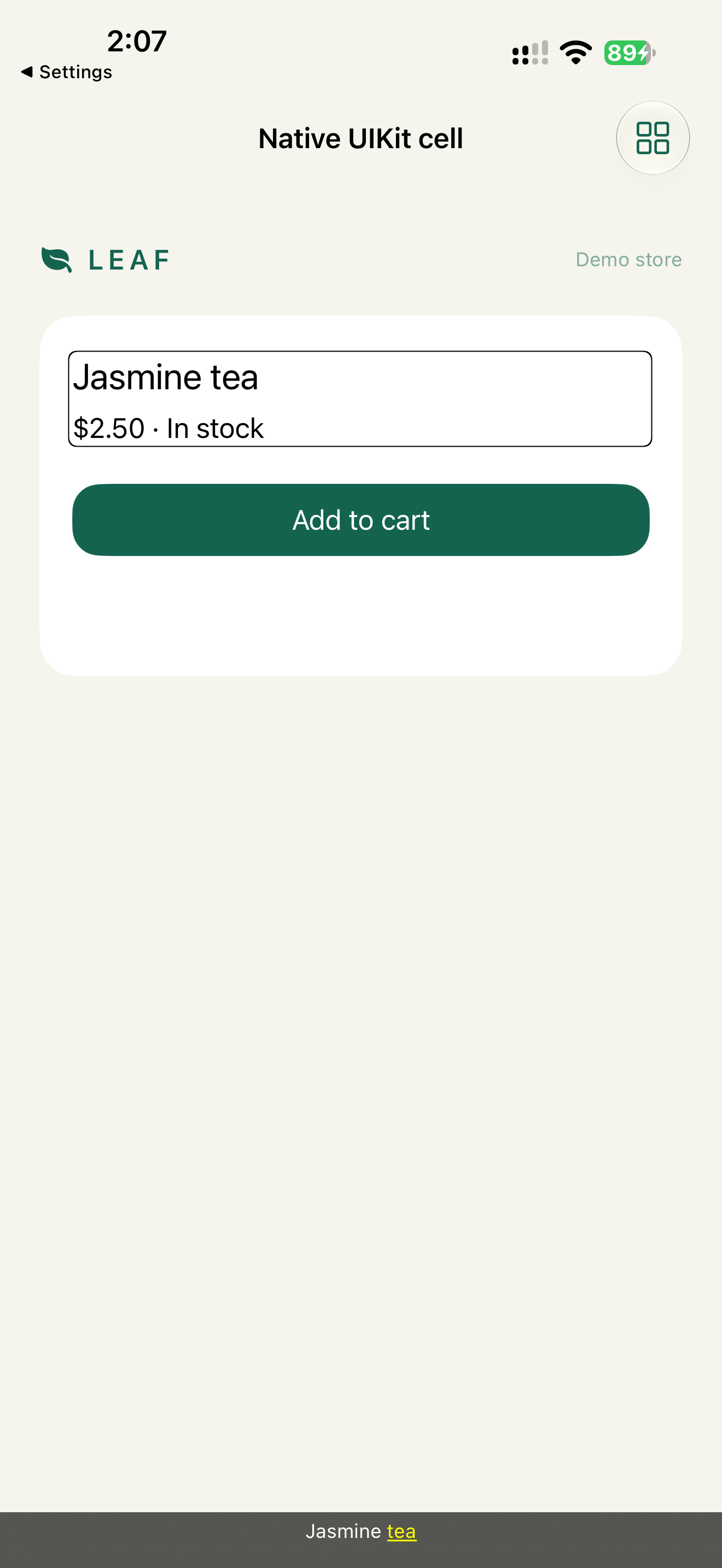
The same Voice Control caveat as Chapter 5 applies to this button: visible "Add to cart", label "Add jasmine tea to cart". Add accessibilityUserInputLabels = ["Add to cart"].
Check: two VoiceOver stops per cell. Accessibility Inspector shows the label and value on the stack view and nothing on the labels inside.
Decision 2: A custom control declares what it is
Verdict: a custom on/off row uses .toggleButton (iOS 17+) and a value. A custom tappable view uses .button and implements activation.
final class NotificationsRow: UIView {
    var isOn = false { didSet { accessibilityValue = isOn ? "On" : "Off" } }

    override init(frame: CGRect) {
        super.init(frame: frame)
        isAccessibilityElement = true
        accessibilityLabel = "Notifications"
        accessibilityTraits = .toggleButton
        accessibilityValue = "Off"
    }
    required init?(coder: NSCoder) { fatalError() }

    override func accessibilityActivate() -> Bool {
        isOn.toggle()
        return true
    }
}
Why: the trait tells VoiceOver how to read the element and Switch Control that it can be activated. accessibilityActivate() makes VoiceOver double-tap call your code directly, instead of simulating a tap at the element's center. A simulated tap can miss a gesture recognizer attached to a subview.
Simpler option: put a real UISwitch in the row. It does all of this already.
Check: VoiceOver reads "Notifications, Off, switch button". Double-tap changes the value to On.
Decision 3: Drawn content gets synthetic elements
Verdict: each meaningful part of a custom drawing becomes a UIAccessibilityElement with a label, a value and a frame.
let groceries = UIAccessibilityElement(accessibilityContainer: chartView)
groceries.accessibilityLabel = "Groceries"
groceries.accessibilityValue = "35 percent of spending"
groceries.accessibilityFrameInContainerSpace = groceriesSliceBounds
chartView.accessibilityElements = [groceries, transport, other]
Why: CAShapeLayer and draw(_:) produce pixels only. Without synthetic elements the chart doesn't exist for VoiceOver. accessibilityFrameInContainerSpace is required. Without it, the element has no position: touch exploration can't find it, and the focus outline is drawn in the wrong place.
For charts, add Audio Graphs (iOS 15+). VoiceOver users can then hear the data as tones and get a summary:
extension SpendingChartView: AXChart {
    var accessibilityChartDescriptor: AXChartDescriptor? {
        get { makeChartDescriptor() }
        set { }
    }
}
Check: VoiceOver touch exploration on each slice reads its name and value. The rotor shows "Audio Graph" on the chart.
Decision 4: Order is set explicitly when layout doesn't match the task
Verdict: accessibilityElements on the container, in task order.
checkoutContainer.accessibilityElements = [summaryView, addressView, payButton]
Why: UIKit's default order is roughly top-left to bottom-right, by frame. Overlapping views, floating buttons and RTL layouts can produce a different order than the task. An explicit array removes the guesswork. It also has to be updated when views are added, which is the cost.
In RTL, mirrored layout doesn't always fix custom accessibilityElements arrays. Check them in an RTL language.
Decision 5: Gestures become custom actions
Verdict: a custom swipe or long-press gets a UIAccessibilityCustomAction.
cell.accessibilityCustomActions = [
    UIAccessibilityCustomAction(name: "Delete", image: UIImage(systemName: "trash")) { _ in
        delete(order)
        return true
    }
]
UITableView and UICollectionView swipe actions created with UISwipeActionsConfiguration are already exposed as actions. Custom gesture recognizers aren't.
Decision 6: Notifications match the change
Verdict: pick the notification by what actually changed.
| Change | Notification | Argument |
|---|---|---|
| New screen or modal context, custom presentation | .screenChanged |
The element to focus, often the title |
| Part of the screen changed, for example an error appeared | .layoutChanged |
The element to focus, for example the error label |
| A result with nowhere to focus | .announcement |
The text to speak |
errorLabel.text = "Card declined. Try another card."
errorLabel.isHidden = false
UIAccessibility.post(notification: .layoutChanged, argument: errorLabel)
Standard present(_:animated:) and pushViewController post screen changes themselves. Posting .screenChanged again makes VoiceOver restart from the top.
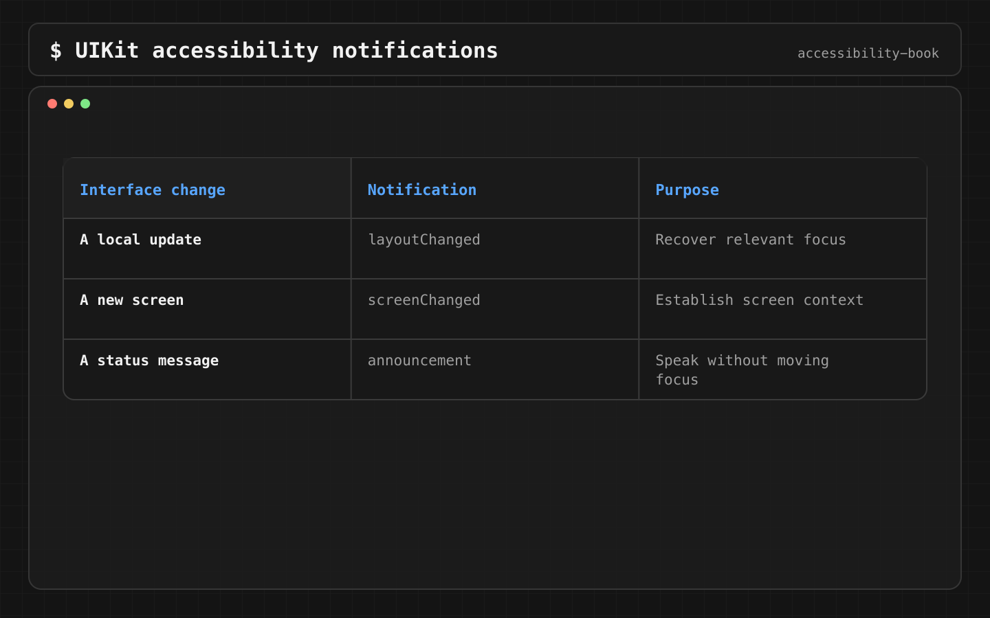
Check: after a failed payment, VoiceOver reads the error immediately. After a standard push, the screen title is read once.
Dynamic Type in UIKit
label.font = UIFont.preferredFont(forTextStyle: .body)
label.adjustsFontForContentSizeCategory = true
label.numberOfLines = 0
Custom fonts go through UIFontMetrics(forTextStyle:).scaledFont(for:). Fixed-height constraints on cells with text are the most common UIKit Dynamic Type bug. Use self-sizing cells. Details: Chapter 6.
Review prompt
In this UIKit code, find: custom views with gesture recognizers but no
traits, cells without isAccessibilityElement or accessibilityElements,
UIAccessibilityElement without a frame, labels with raw enum or asset
names, gesture recognizers without custom actions, .screenChanged after
standard presentation, fixed left/right constraints.
What we don't do
- We don't post
.announcementto cover missing focus. - We don't set
accessibilityLabelon aUIButtonthat already has a correct title. - We don't use private API to read or force VoiceOver state.
Platform notes
- UIKit inside SwiftUI: SwiftUI modifiers on a
UIViewRepresentabledon't reach the subviews inside it. The UIKit code sets its own semantics. - SwiftUI inside UIKit:
UIHostingControllercontent brings its SwiftUI semantics with it.
Related catalog entries
- Label Soup: cells exposed as fragments.
- Reading Order Drift: order follows the view tree, not the task.
- Swipe Trap: gesture-only actions.
- Accessible Card: cells as meaningful elements.
- Meaningful Announcement: notifications without spam.
- Rotor and custom actions: guide.
Chapter takeaway
In UIKit, nothing custom is accessible by default. Group cells, declare traits and activation, give drawn content elements with frames, set order explicitly, choose the notification by the change.
Sources
- Apple Developer: Accessibility for UIKit
- Apple Developer: UIAccessibilityElement
- Apple Developer: accessibilityFrameInContainerSpace
- Apple Developer: UIAccessibilityTraits.toggleButton
- Apple Developer: UIAccessibilityCustomAction
- Apple Developer: UIAccessibility.Notification
- Apple Developer: AXChart
- Apple Developer: accessibilityElements