5. VoiceOver in practice
Status: draft
Chapter goal
VoiceOver reads semantics, not pixels. Each element gives it a label, a value, traits, sometimes a hint, a position in the order and a set of actions. This chapter treats each of these as an implementation decision and checks it against a real VoiceOver transcript from the Leaf demo.
The screen
A product card in the Leaf demo store: tea illustration, name, weight, price, stock status, Add to cart button.
Without any accessibility work, VoiceOver splits the card into separate stops: decorative image, name, weight, price, "In stock", button. That's six swipes to reach one action, and the price and the name are never heard together.
What the user needs from this card is three answers: what is it, how much is it, how do I buy it. Two stops are enough.
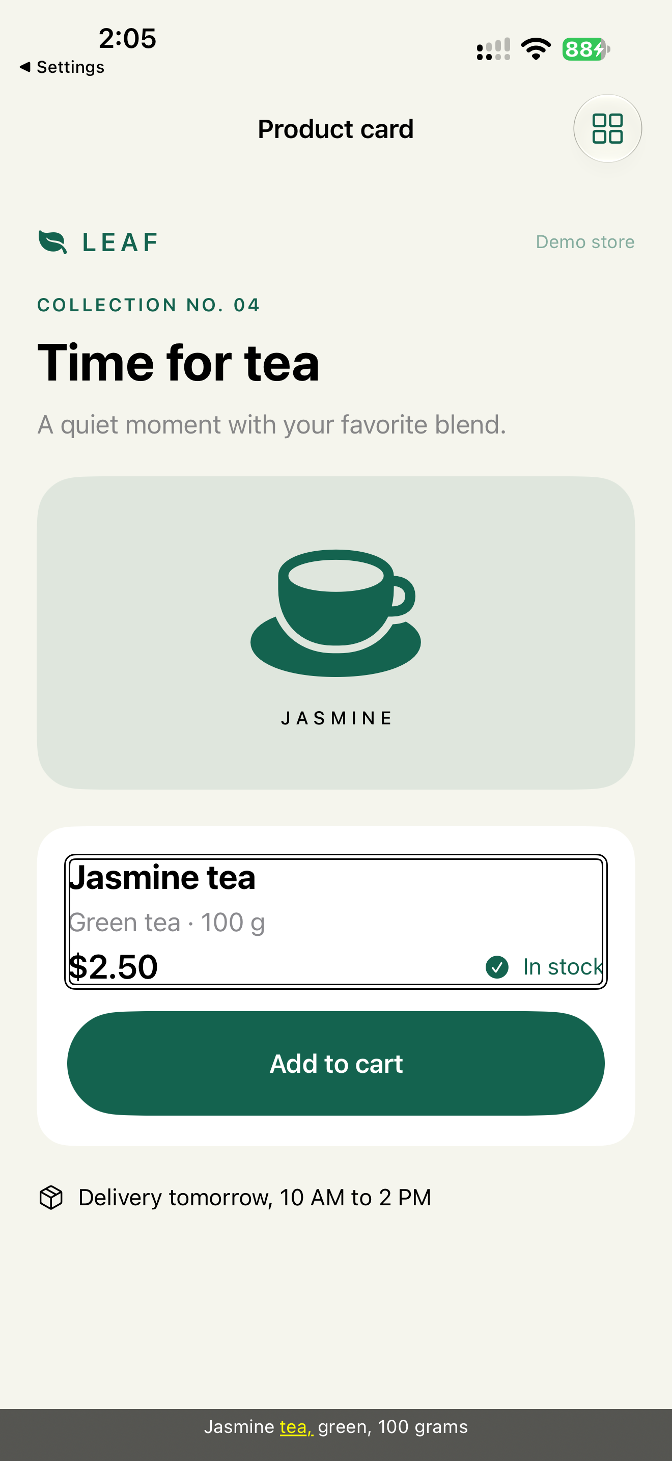
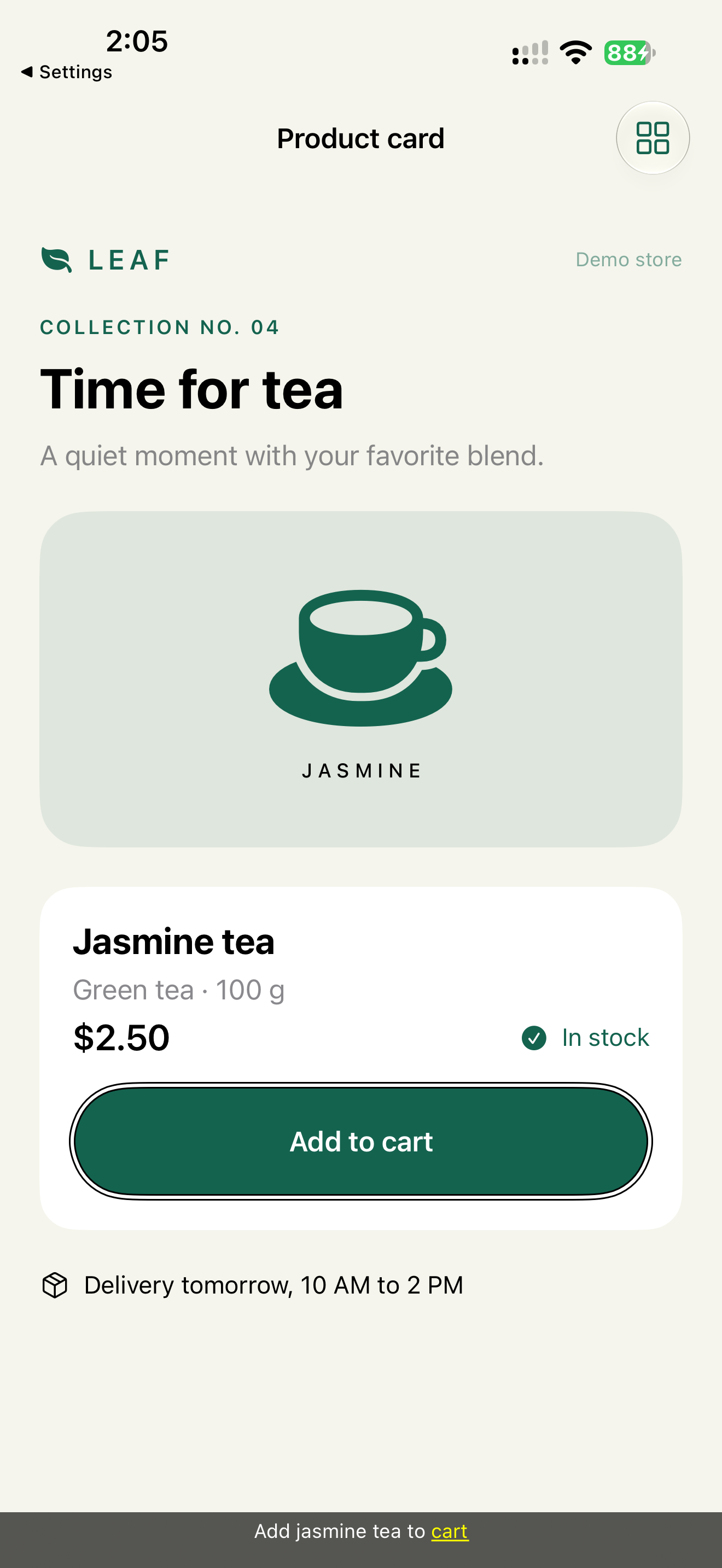
Actual transcript for these two stops, from all-evidence.json:
Jasmine tea, green, 100 grams 2 dollars and 50 cents, in stock
Add jasmine tea to cart Button
How to see what VoiceOver says
Listening is slow, and you can't paste it into a bug report. Turn on the Caption Panel: Settings → Accessibility → VoiceOver → Caption Panel. It shows the text VoiceOver is speaking at the bottom of the screen. It has nothing to do with video subtitles or Live Captions. See Apple: Change your VoiceOver settings.
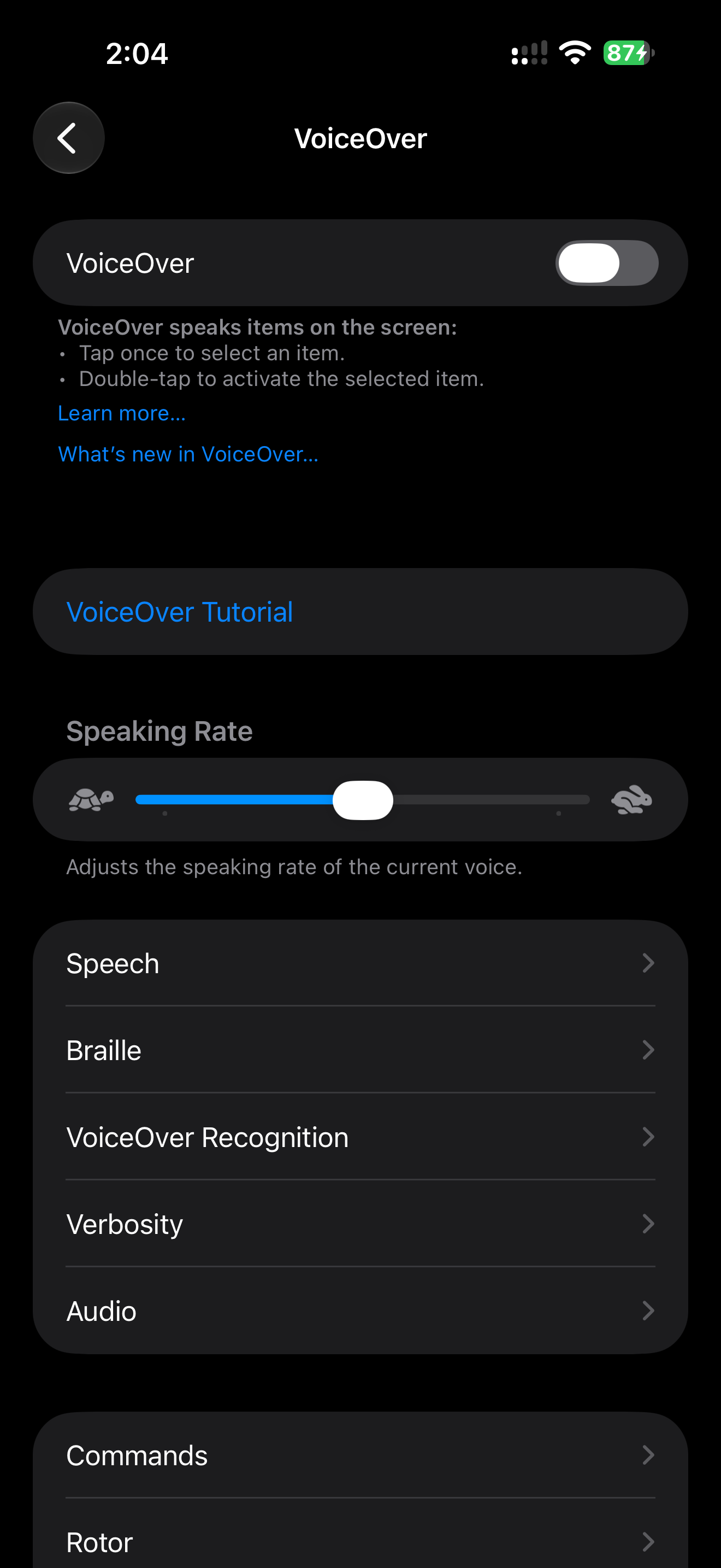
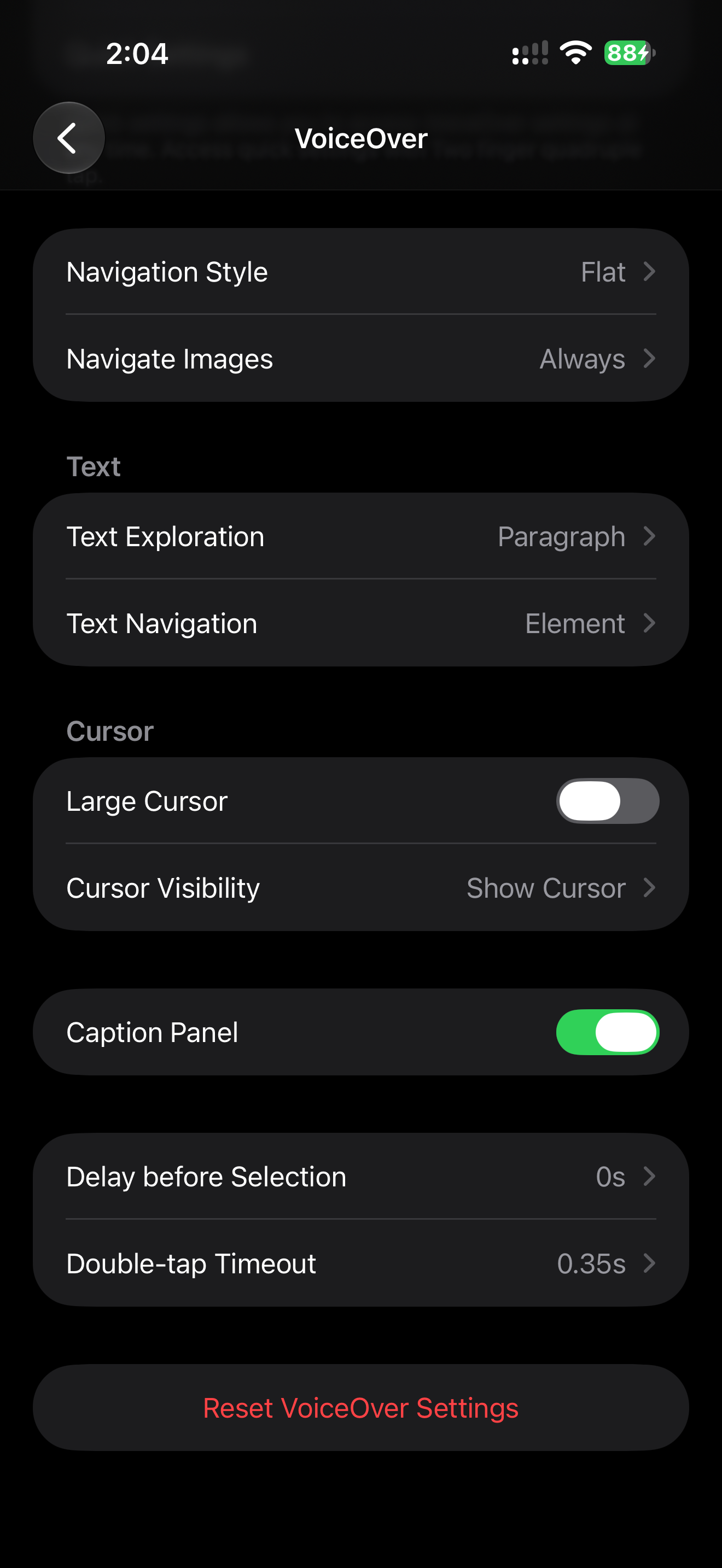
All screenshots in this chapter were captured on iOS 27.0.1, one version above the book baseline. The APIs used here have been stable since iOS 13–17.
The parts of an element
| Part | Answers | Example | Who sets it |
|---|---|---|---|
| Label | What is it? | "Volume" | You, or the control's text |
| Value | What state is it in? | "50 percent" | You, or the control |
| Traits | What kind of thing, how does it behave? | button, adjustable, selected, heading | Native controls set them; custom views need them added |
| Hint | What happens if I activate it? Only when not obvious | "Swipe up or down with one finger to adjust the value." | You; system controls add their own |
| Order | When do I hear it? | after the price, before Pay | Layout, or accessibilitySortPriority |
| Actions | What else can I do here? | Reorder, Delete | accessibilityAction, custom actions |
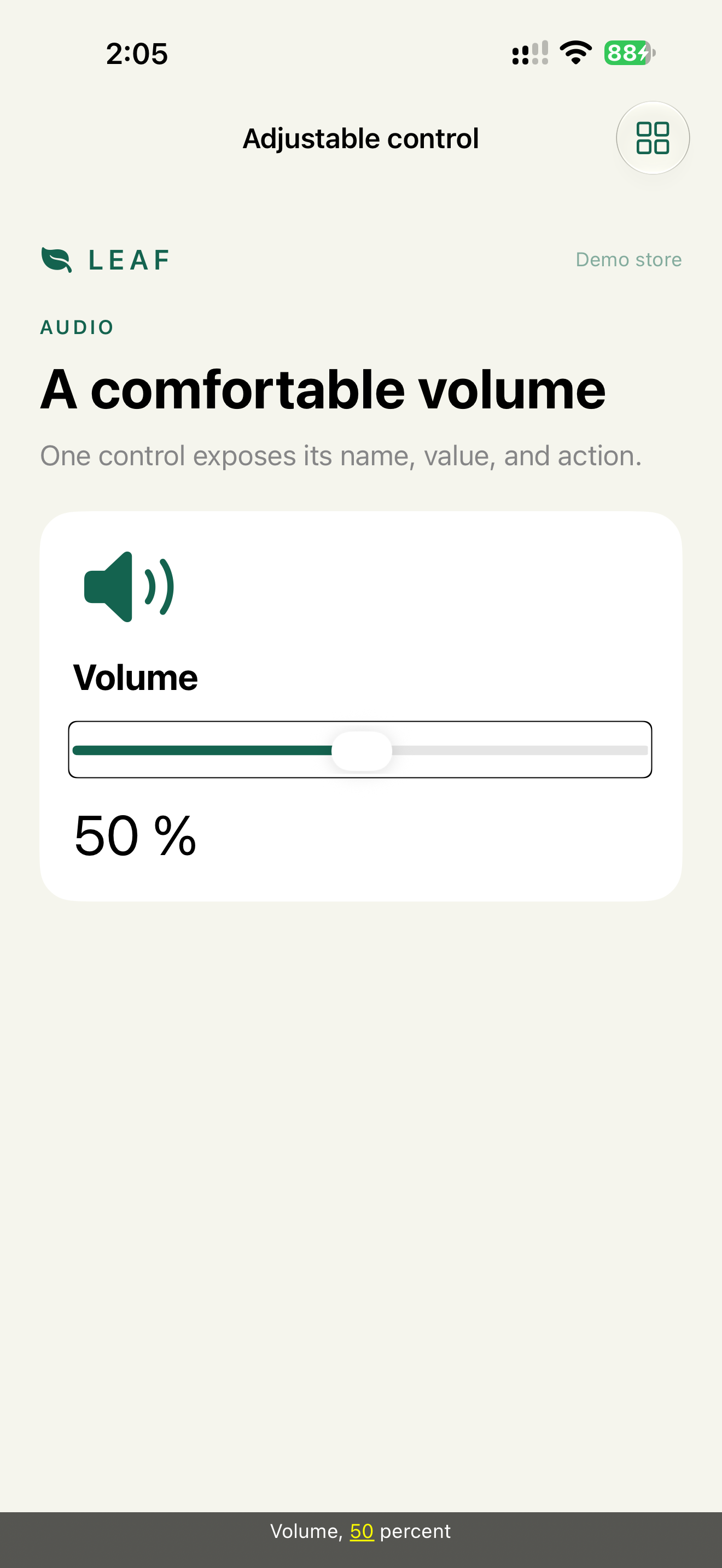
The native slider in the demo shows four of them in one utterance:
Volume 50 percent adjustable Swipe up or down with one finger to adjust the value.
label  value      trait      hint (added by the system)
Constraints
- The role never goes in the label. "Save button" plus the button trait is read as "Save button, button".
accessibilityIdentifieris not a label. It's for UI tests only. VoiceOver never reads it.- A hint is optional. Users can turn hints off in VoiceOver settings. Anything critical goes into the label or the value.
- Announcements are for task results. Not for animations, not for every state change.
Decision 1: Group the description, keep the action separate
Verdict: one element for the description, one for each action. Not one element for the whole card.
Why: six stops are noise (Label Soup). One stop for the whole card hides the button inside it (Over Grouped Control). Two stops give the full description, then the action.
Code from the demo:
teaDescription()
    .accessibilityElement(children: .ignore)
    .accessibilityLabel("Jasmine tea, green, 100 grams")
    .accessibilityValue("2 dollars and 50 cents, in stock")

Button(inCart ? "Added to cart" : "Add to cart") { inCart.toggle() }
    .accessibilityLabel("Add jasmine tea to cart")
    .accessibilityInputLabels(["Add to cart", "Add jasmine tea to cart"])
    .accessibilityValue(inCart ? "Added" : "")

illustration
    .accessibilityHidden(true)
.ignore drops the children and uses only the label and value you write. .combine would join the children's text automatically. Use .combine when the visible text is already good. Use .ignore when you need different wording, like "100 grams" instead of "100 g".
Check: two swipes from the card title to the next card. The transcript matches the two lines above.
Why the input labels: Voice Control
The button shows "Add to cart" and has the label "Add jasmine tea to cart". A Voice Control user reads "Add to cart" on screen and says "Tap Add to cart". That phrase is not a contiguous part of the label, so without help the command may not match. WCAG calls this Label in Name (2.5.3).
Two ways to keep it: start the label with the visible text, or give Voice Control extra names with accessibilityInputLabels, as the code above does. The first input label is the one Voice Control shows in its overlay. VoiceOver still reads accessibilityLabel. More in Chapter 8.
Decision 2: Name in the label, state in the value
Verdict: the label stays the same, the value changes.
Why: when the state is in the label, every change rewrites the name. Voice Control loses the command, and VoiceOver users hear a different element each time. Value also localizes separately from the name.
Toggle("Captions", isOn: $captions)
A native Toggle already has a value: VoiceOver reads "Captions, on" or "off". We don't add accessibilityValue to it. Custom views need it set explicitly:
CaptionsSwitch(isOn: $captions)
    .accessibilityLabel("Captions")
    .accessibilityValue(captions ? "On" : "Off")
    .accessibilityAddTraits(.isButton)
Check: toggle it twice. The label stays the same, only the value changes.
Decision 3: Mark headings
Verdict: every visual section title gets the header trait.
Why: VoiceOver users move between headings with the rotor. Without the trait, a 20-element screen means 20 swipes.
The demo had this bug. Before the fix, the transcript read the screen title as plain text:
COLLECTION NO. 04
Time for tea
No "Heading", and the rotor's Headings mode found nothing. After the fix, the device transcript says "Time for tea Heading". The fix is one line:
Text("Time for tea")
    .font(.largeTitle.bold())
    .accessibilityAddTraits(.isHeader)
Check: set the rotor to Headings and swipe down. Each section title is reached in one swipe.
Decision 4: Secondary actions go into custom actions
Verdict: in a repeated row, the main action is the row itself. Secondary actions go into the actions list.
Why: a list of 20 orders with Reorder, Share and Delete buttons on each row means 80 stops. With custom actions it's 20. The user swipes up or down on a row to choose an action. Switch Control shows the same actions in its menu. This is also the alternative to swipe-to-delete for users who can't swipe.
OrderRow(order: order)
    .accessibilityElement(children: .combine)
    .accessibilityAction(named: "Reorder") { reorder(order) }
    .accessibilityAction(named: "Delete") { delete(order) }
UIKit:
cell.isAccessibilityElement = true
cell.accessibilityLabel = "Order 42"
cell.accessibilityValue = "Delivered, November 12, 7 dollars 50 cents"
cell.accessibilityCustomActions = [
    UIAccessibilityCustomAction(name: "Reorder") { _ in
        reorder(order)
        return true
    }
]
Limit: custom actions can't be discovered by looking at the screen. If an action is primary or dangerous, keep it as a visible button. The demo's order history keeps Reorder visible for exactly this reason.
Check: on a row, VoiceOver says "Actions available". Swiping down lists Reorder and Delete.
Decision 5: Order follows the task
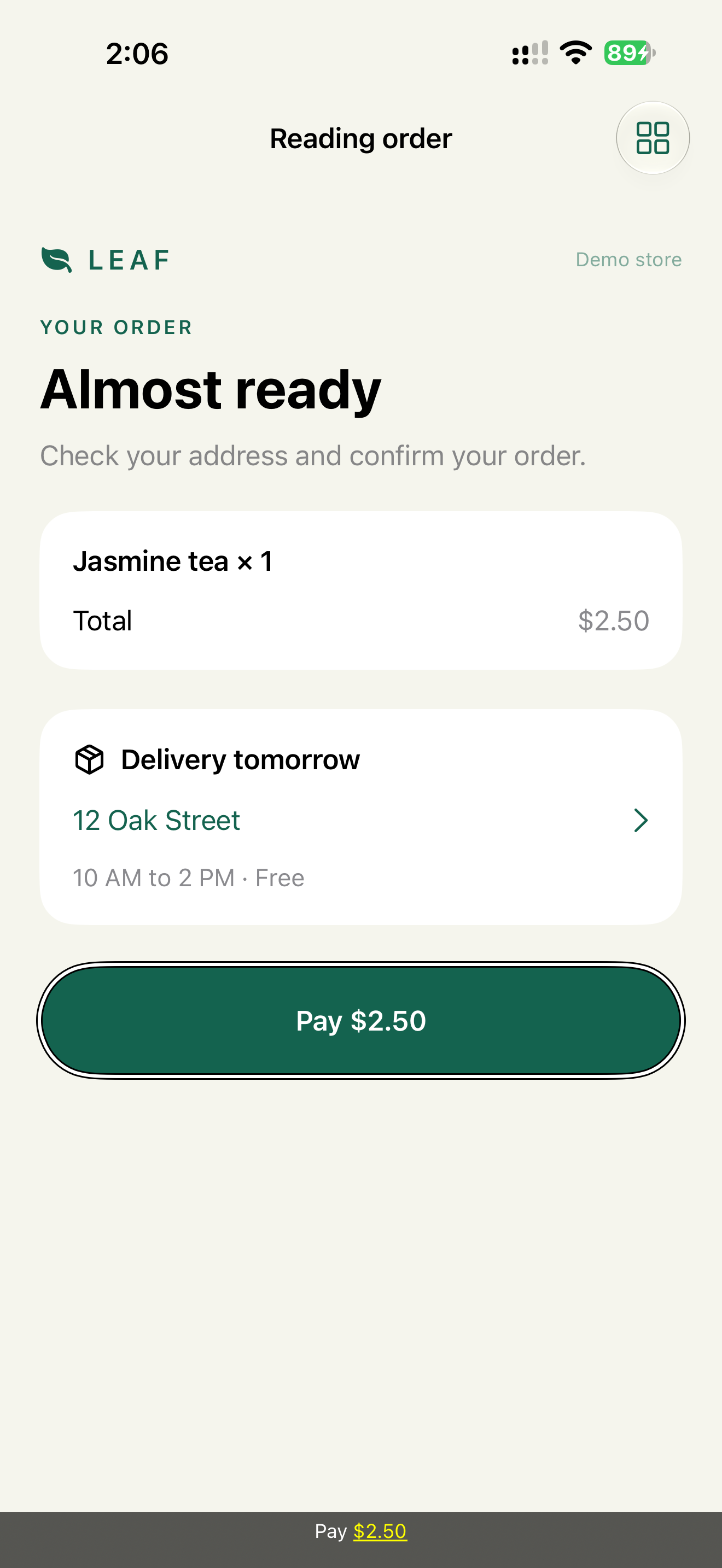
Verdict: VoiceOver order matches what the user does on the screen: product, address, payment. When the layout order is wrong, fix the layout first. accessibilitySortPriority comes second.
Why: VoiceOver reads top-left to bottom-right. Overlays, ZStack and custom layouts break this. A Pay button read before the address means the user pays before checking where it goes.
If a fix in layout isn't possible:
VStack {
    summary.accessibilitySortPriority(3)
    address.accessibilitySortPriority(2)
    payButton.accessibilitySortPriority(1)
}
.accessibilityElement(children: .contain)
Higher priority is read first. Priority only works among siblings inside one container. That's why the container is .contain.
Check: swipe from the top. The order matches the task order written in the ticket.
Decision 6: Announce the result, not the process
Verdict: one announcement when a task completes. Nothing during it.
AccessibilityNotification.Announcement("Added to cart. Cart has 3 items.").post()
Why: the user pressed Add and focus stayed on the button. Without the announcement, they would have to find the cart badge to confirm the action worked. With an announcement for every animation and counter tick, speech is constantly interrupted (Announcement Spam).
The announcement goes alongside the visual change, it doesn't replace it. The badge updates, the button value changes to "Added". The announcement is a shortcut for VoiceOver users, not the only record.
Check: add an item. VoiceOver says it once, and the button now reads "Added".
Bug report format
A transcript turns a vague bug into a specific one:
Task:     add tea to cart
Expected: Jasmine tea, green, 100 grams, 2 dollars and 50 cents, in stock
          Add jasmine tea to cart, button
Actual:   image
          Jasmine tea
          Green tea · 100 g
          $2.50
          In stock
          Add to cart, button
Expected is written before implementation. Actual comes from the Caption Panel or the UI test transcript. AI can compare the two and suggest a fix. Confirming the fix still takes a device.
What we don't do
- We don't fill in every hint. The system adds hints for native controls, and users can turn hints off.
- We don't hide visible actions in custom actions.
- We don't post announcements to cover up wrong focus. Focus problems are fixed with focus (Chapter 4).
Platform notes
- SwiftUI:
accessibilityElement(children:),accessibilityLabel,accessibilityValue,accessibilityAddTraits,accessibilityAction(named:),accessibilitySortPriority. Chapter 10. - UIKit:
isAccessibilityElement,accessibilityElementsfor order,accessibilityCustomActions,UIAccessibility.post. Chapter 11. - AppKit: the same parts under different names: role, label, value, help. Keyboard focus comes first. Chapter 12.
Related catalog entries
- Label Soup: VoiceOver reads fragments.
- Over Grouped Control: grouping swallowed the action.
- Announcement Spam: the app speaks too often.
- Right Sized Grouping: between noise and hidden controls.
- Accessible Card: description plus separate action.
- Rotor and custom actions: guide.
- VoiceOver output debugging: guide.
- VoiceOver gestures guide: manual walkthrough.
Chapter takeaway
Write the expected VoiceOver output before the code, then compare it with the transcript. Fewer stops, state in the value, headings marked, secondary actions in the actions list.
Sources
- Apple Support: Turn on and practice VoiceOver on iPhone
- Apple Support: Use VoiceOver in apps on iPhone
- Apple Developer: SwiftUI accessibility modifiers
- Apple Developer: accessibilityElement(children:)
- Apple Developer: accessibilityInputLabels
- Apple Developer: UIAccessibilityCustomAction
- Apple Developer: AccessibilityNotification
- W3C: Understanding SC 2.5.3 Label in Name