7. Motor accessibility
Status: draft
Chapter goal
Motor accessibility breaks when the UI assumes a precise, fast, steady finger. Tremor, limited reach, one hand, a switch instead of a finger, a voice instead of a hand all break that assumption. This chapter covers the five places it usually fails: target size, gestures, scanning, time limits and destructive actions.
The screen
The Leaf demo cart: a list of items, an "add" icon on each one, a close button on the sheet, a date scroller for delivery. With a steady finger, it works. Then:
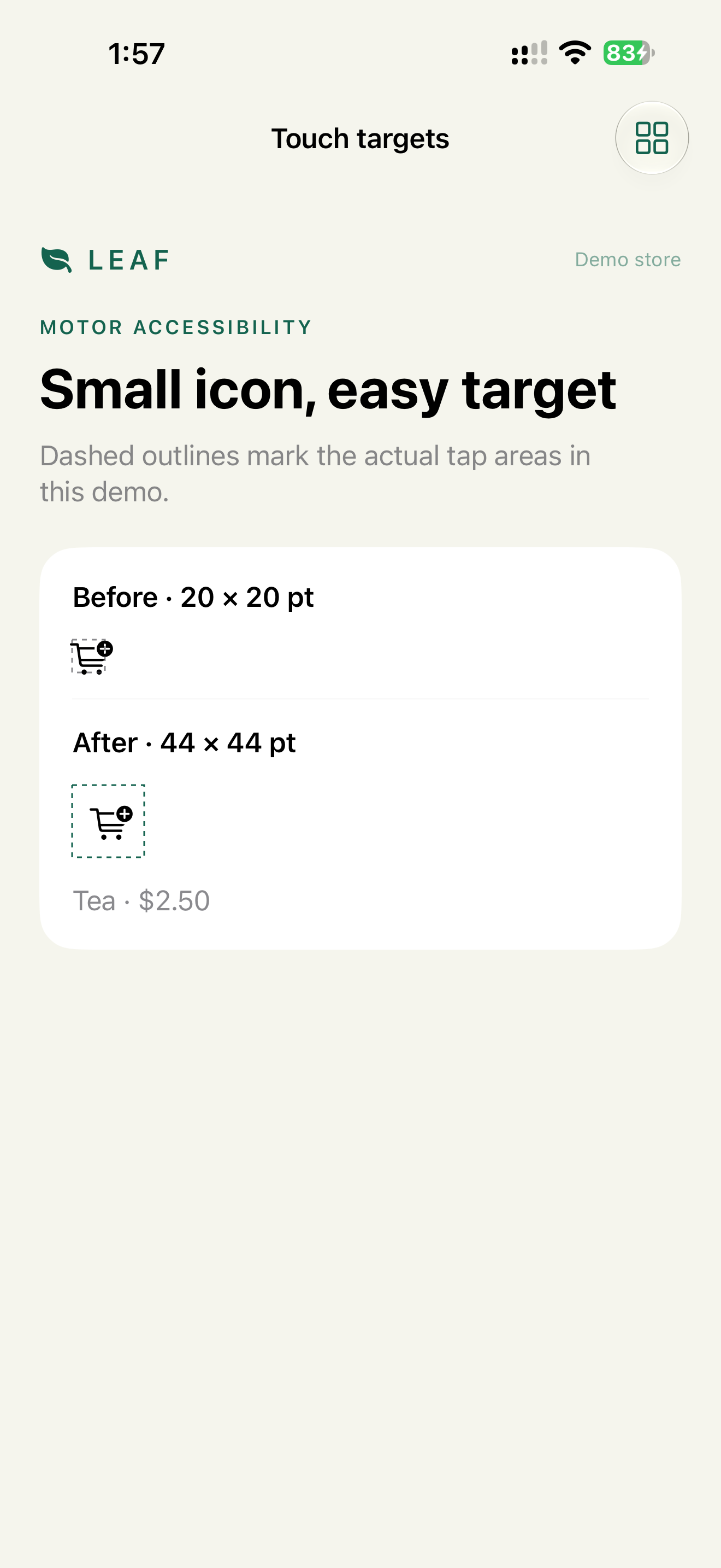
- The add icon is 20 × 20 pt. With a tremor, half the taps miss and land on the row, which opens the product instead.
- Remove item is swipe only. A Switch Control user can't swipe.
- The date scroller sits on the bottom edge. Dragging it triggers the Home gesture.
- The payment session expires in 60 seconds. A Switch Control user moving through a form needs several minutes.
- Delete order sits 8 pt from Reorder. One slip is a lost order.
Who uses what
| Method | Who | What it needs from the app |
|---|---|---|
| Touch with larger targets | Tremor, limited precision | Hit areas of at least 44 × 44 pt |
| AssistiveTouch | Can't press hardware buttons or do multi-finger gestures | Single-tap paths for everything |
| Switch Control | One or two switches, head movement, sip-and-puff | Focusable elements, actions without gestures, no tight time limits |
| Voice Control | Can't use hands | Visible, unique names (Chapter 8) |
| Full Keyboard Access, keyboard | Can't use the touchscreen, or prefers keys | Focus order, keyboard shortcuts |
| Pointer, Dwell | Head tracking, joystick, eye tracking on iOS 18+ | Hit areas that match the visible element |
Constraints
- 44 × 44 pt minimum hit area for every control, per Apple HIG. The visible icon can be smaller.
- Every gesture has a second path. Same rule as Chapter 3.
- No time limit without a way to extend it. Payment and security limits are allowed, as long as the user can ask for more time.
- We don't make the visible icon bigger to fix the hit area. The design stays. The tap area grows.
Decision 1: Small icon, 44 pt hit area
Verdict: the icon stays at its design size. The tappable frame is at least 44 × 44 pt.
Code from the demo:
Button { addToCart() } label: {
    Image(systemName: "cart.badge.plus")
        .font(.system(size: 20))
        .frame(width: 44, height: 44)
        .contentShape(Rectangle())
}
.buttonStyle(.plain)
.accessibilityLabel("Add tea to cart")
Two details:
.contentShapegoes inside the label, after the frame. On theButtonfrom outside, it doesn't make the hit area bigger..padding(12)around a 17 ptxmarkgives about 41 pt. That's close, but under 44. Set the frame explicitly.
Why: Apple's guideline is 44 × 44 pt. WCAG 2.2 AA asks for at least 24 × 24 CSS px (2.5.8 Target Size, Minimum), so 44 pt passes both. Switch Control point scanning and Dwell also select by position, so a bigger area helps them too.
Check: Accessibility Inspector → audit → "Hit area is too small". Or turn on the demo-style dashed overlay in a debug build.
Decision 2: Gestures are shortcuts
Verdict: swipe, drag, long press and multi-finger gestures each have a button or an accessibility action.
CartRow(item)
    .swipeActions {
        Button("Remove", role: .destructive) { remove(item) }
    }
In a SwiftUI List, swipeActions is exposed to VoiceOver and Switch Control as actions automatically. A custom gesture isn't:
CartRow(item)
    .gesture(DragGesture().onEnded { if $0.translation.width < -80 { remove(item) } })
    .accessibilityAction(named: "Remove") { remove(item) }
The bottom-edge date scroller is covered in Chapter 3, Decision 4: Previous/Next buttons, and the control moved off the system gesture area.
Check: remove an item with Switch Control. Change the date with Voice Control: "Tap Next day".
Decision 3: Scanning stops are tasks, not views
Verdict: Switch Control scans meaningful groups. The product card is one stop that opens the product. The add button is a second stop.
NavigationLink(value: product) {
    ProductSummary(product)
}
.accessibilityElement(children: .combine)

AddToCartButton(product)
Why: Switch Control item scanning moves one element at a time, at a fixed speed. The default is about 1 second per item. A card split into 6 elements, in a list of 10 cards, is 60 stops and about a minute to reach the bottom. Two stops per card is 20.
Switch Control also uses group scanning: it first highlights a group, then items inside it. Containers created with .accessibilityElement(children: .contain) become groups.
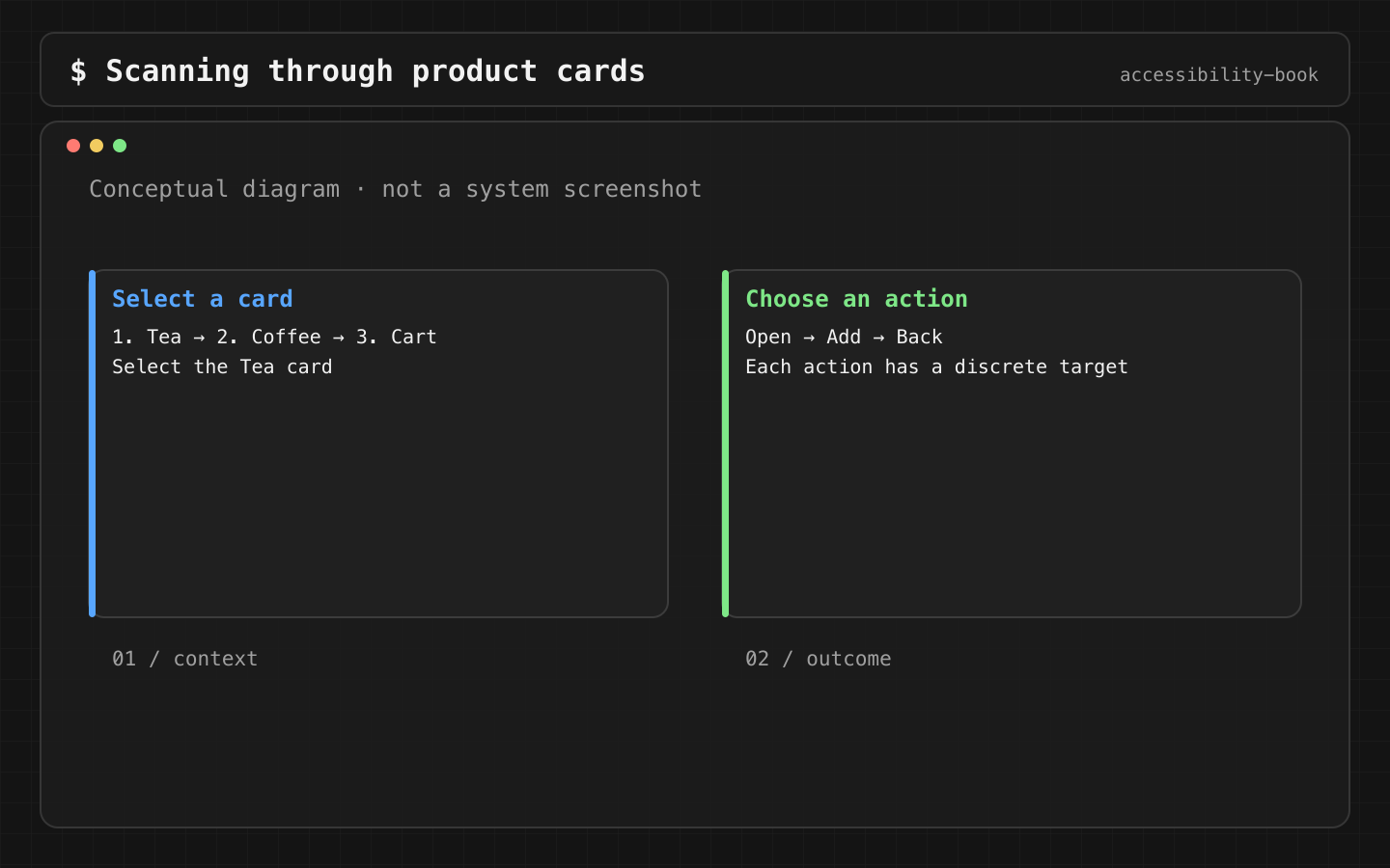
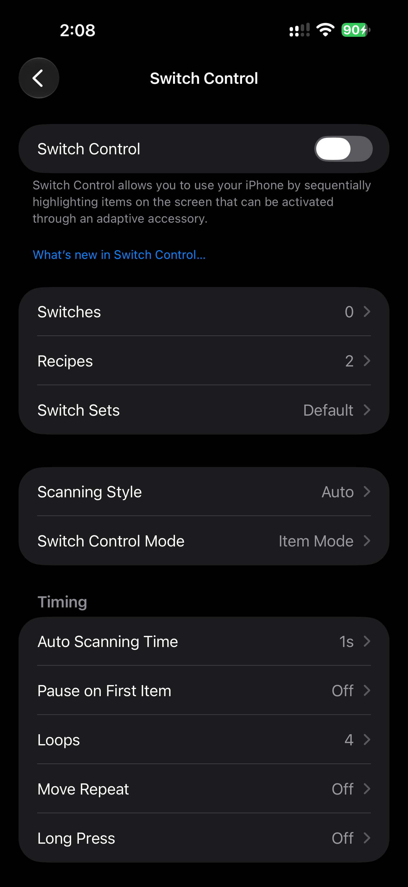
Check: count the stops from the top of the screen to Pay with Switch Control item scanning. Write the number in the ticket. If it grows after a change, find out why.
Decision 4: Time limits can be extended
Verdict: every time limit warns before it expires and offers more time. Payment and security limits are included.
.alert("Session expires in 30 seconds", isPresented: $showTimeoutWarning) {
    Button("Extend 5 minutes") { session.extend(by: .minutes(5)) }
    Button("Cancel order", role: .cancel) { cancel() }
}
Why: a form that takes 40 seconds by touch can take 4 minutes with Switch Control or Voice Control. A 60-second payment timeout fails exactly those users. WCAG 2.2.1 Timing Adjustable asks for the option to extend at least 10 times the default, or to turn the limit off.
The warning itself has to be reachable. An alert takes VoiceOver focus and becomes the scanning target for Switch Control automatically.
Details: Time Extension, Timeout Pressure.
Check: complete checkout with Switch Control, at the default scanning speed, and time it. The timeout has to be longer, or extendable.
Decision 5: Destructive actions are separated and confirmable
Verdict: Delete is away from the primary action and asks for confirmation.
Button("Delete order", role: .destructive) { confirmDelete = true }
    .confirmationDialog("Delete order 42?", isPresented: $confirmDelete) {
        Button("Delete", role: .destructive) { delete() }
    }
Why: tremor and Switch Control misselection both produce wrong taps. A wrong tap on Reorder costs a second. A wrong tap on Delete costs the order. role: .destructive also makes VoiceOver and the visual style mark it as destructive.
Check: primary and destructive actions aren't adjacent, or there's at least one row between them. Destructive actions ask for confirmation, or offer undo.
Keyboard and pointer
On iPad, and on iPhone with Full Keyboard Access, a keyboard is a primary input method.
Button("Pay") { pay() }
    .keyboardShortcut(.defaultAction)

Button("Cancel") { cancel() }
    .keyboardShortcut(.cancelAction)
.defaultAction maps to Return, .cancelAction to Escape. Native controls are focusable with Full Keyboard Access without extra code. Custom views with tap gestures aren't, which is one more reason for Chapter 3, Decision 1.
Pointer and Dwell users select by position: the visible element and its hit area have to match. A 44 pt area around a 20 pt icon is fine. A hit area shifted away from the icon is not.
Review prompt
Review this screen for: hit areas under 44×44 pt, gesture-only actions,
time limits without extension, destructive actions next to primary ones,
Switch Control stops per card. Give the element and the fix for each.
AI finds candidates from code and screenshots. Stop counts and timings still come from a device.
What we don't do
- We don't enlarge icons to fix hit areas. The frame grows, the icon stays.
- We don't put drag controls on the bottom system edge.
- We don't build Switch Control-specific UI. A clear accessibility tree is what Switch Control needs.
Platform notes
- SwiftUI:
.frame(minWidth: 44, minHeight: 44)plus.contentShapeinside the label,swipeActions,accessibilityAction(named:),keyboardShortcut. - UIKit: override
point(inside:with:)or use a larger button with a smaller image,UIAccessibilityCustomActionfor gesture recognizers,UIKeyCommand. Chapter 11. - AppKit: keyboard shortcuts and menu commands are the main motor access path. Chapter 12.
Related catalog entries
- Tiny Target: control exists but is hard to hit.
- Swipe Trap: action exists only as a gesture.
- Timeout Pressure: a time limit ignores slower input methods.
- Edge Gesture Collision: edge control conflicts with system gestures.
- Gesture Alternative: a non-gesture path.
- System Gesture Safe Zone: keep drag controls off system edges.
- Time Extension: extendable time limits.
- Switch Control scanning: guide.
Chapter takeaway
44 pt hit areas, a second path for every gesture, extendable time limits, destructive actions kept apart. Count Switch Control stops for every critical flow.
Sources
- Apple Human Interface Guidelines: Accessibility
- Apple Human Interface Guidelines: Buttons
- Apple Support: Accessibility features for mobility on iPhone
- Apple Support: Use AssistiveTouch on iPhone
- Apple Support: Use Switch Control on iPhone to select items and perform actions
- Apple Support: Connect a pointer device to iPhone
- Apple Developer: accessibilityAction
- Apple Developer: UIAccessibilityCustomAction
- Apple Developer: keyboardShortcut
- W3C: Understanding SC 2.5.8 Target Size (Minimum)
- W3C: Understanding SC 2.2.1 Timing Adjustable