17. Screen case studies
Status: draft
Chapter goal
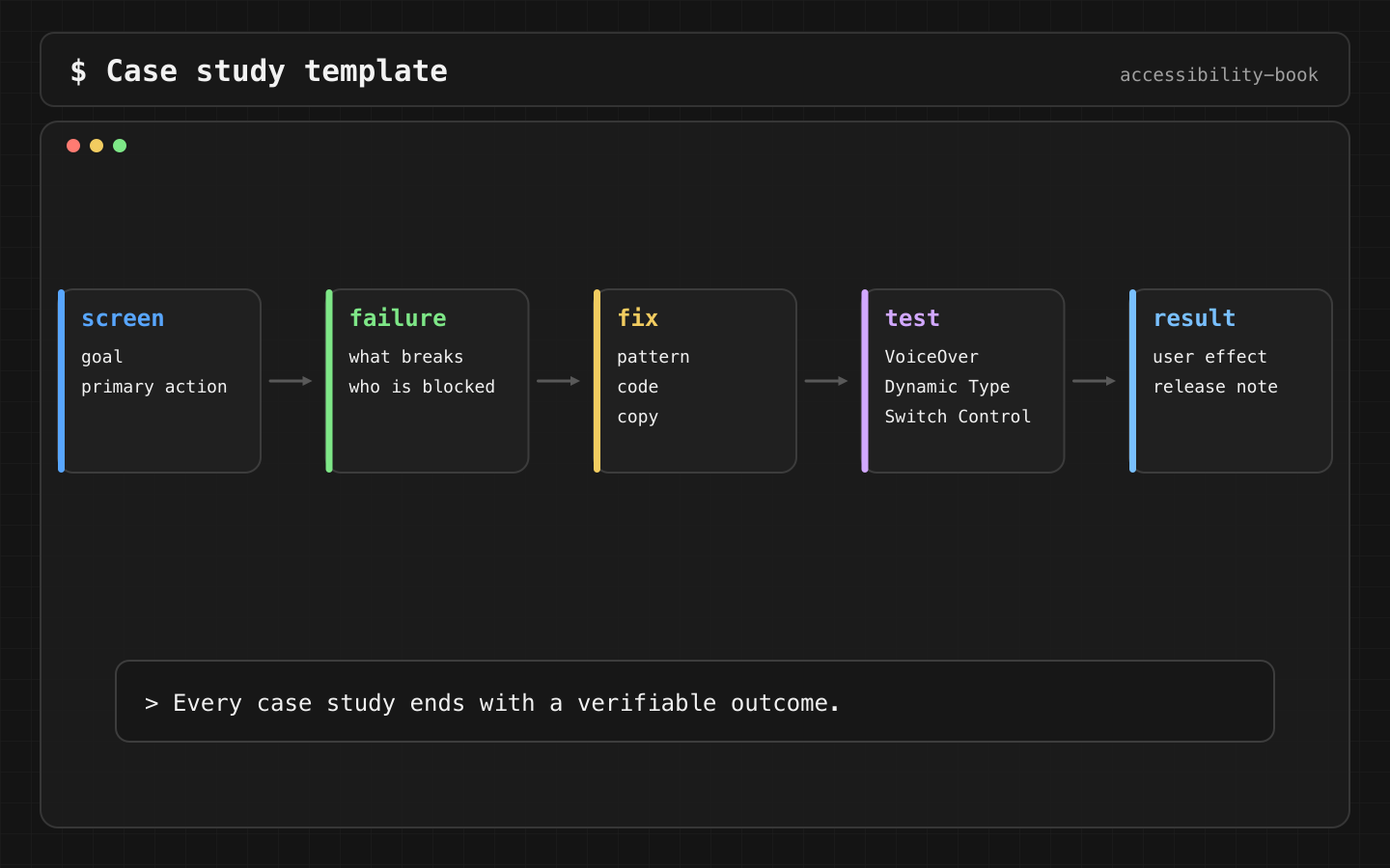
Earlier chapters go by topic. This one goes by screen: search, checkout form, settings, map, media, onboarding. Each case covers what breaks, the code fix, the check and the catalog entries that apply. Use a case as a template when reviewing a real screen.
How to read a case
Each case has the same structure:
- Goal: what the user is trying to do.
- Breaks: what fails, and with which profile.
- Fix: the code.
- Check: how to confirm it, with the expected output.
A case without a check is advice. A case with a check can go into a ticket.
Case 1: Search
Goal: find a tea, or learn that there's none and what to do next.
Breaks: results update in place as the user types. A VoiceOver user in the search field hears nothing: 40 results and zero results sound the same. The empty state has "No results" and no next step.
Fix: announce the count after typing stops. Make the empty state a heading with a recovery action.
.task(id: query) {
    do { try await Task.sleep(for: .milliseconds(600)) } catch { return }
    AccessibilityNotification.Announcement(
        results.isEmpty ? "No results" : "\(results.count) results"
    ).post()
}

if results.isEmpty {
    Text("No results found").font(.title2.bold())
        .accessibilityAddTraits(.isHeader)
    Text("Try another search or clear your filters.")
    Button("Clear filters") { query = "" }
}
A heading trait helps navigation by rotor but doesn't announce anything on its own. The announcement is what tells the user that the results changed. Full explanation: Chapter 4, State 2.
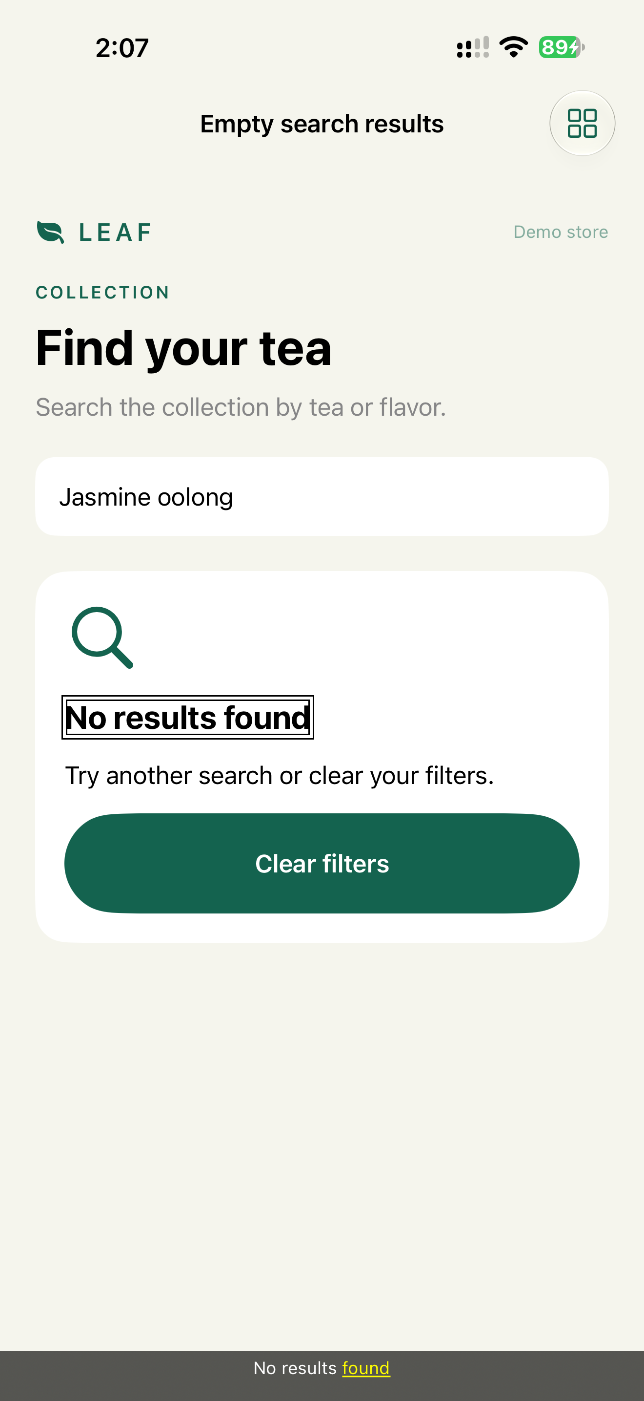
Check: type a query with no results. VoiceOver says "No results" once, after typing stops. The Headings rotor finds "No results found". Clear filters is the next element.
Catalog: Silent Error, Meaningful Announcement.
Case 2: Checkout form
Goal: enter an email and an address, recover from a validation error, continue.
Breaks: two separate bugs.
- The visible label "Email" is a separate
Text, and the field has no name of its own. VoiceOver reads the heading as one stop and the field as another. Once the field is filled, it reads only the value: "anna@example.com, Text field". On a 6-field form the user has to guess which value belongs to which field. - The error appears under the field, but focus stays on Continue.
Fix:
Text("Email").font(.headline)
    .accessibilityHidden(true)                       // the field carries the name
TextField("Email", text: $email, prompt: Text("name@example.com"))
    .accessibilityLabel("Email")
    .accessibilityValue(emailError.map { "\($0). \(email)" } ?? email)

if let emailError {
    Label(emailError, systemImage: "exclamationmark.circle.fill")
        .foregroundStyle(.red)
        .accessibilityFocused($errorFocused)
}
The explicit accessibilityLabel is the field's name. Don't rely on the first argument of TextField: in the demo on iOS 27, a filled field with a title and a prompt: read only its value, and the name came back only with the explicit label. prompt: is the visible placeholder. The visible "Email" heading is hidden from VoiceOver so the name isn't read twice. The error is in the field's value, so it's heard when the user comes back to the field, and focus moves to the error text after submit.
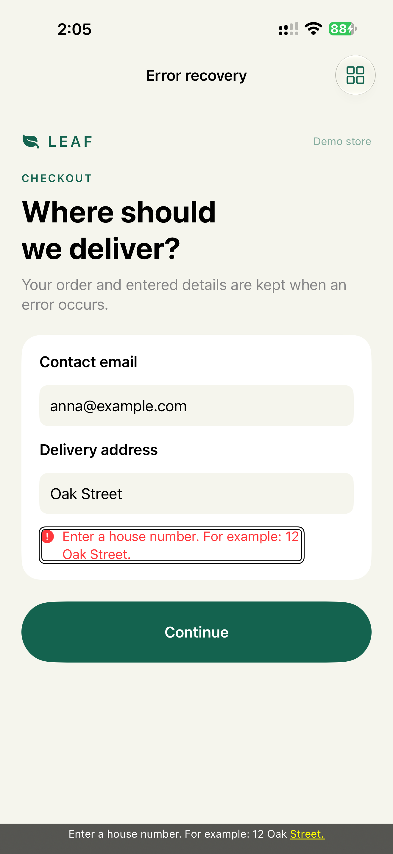
The test double-taps Continue with VoiceOver on and reads the speech without swiping, so the capture shows focus on the error right after the action. Device transcript of the form: "Contact email anna@example.com Text field", "Delivery address Oak Street Text field", "Continue Button", then "Enter a house number. For example: 12 Oak Street." Chapter 13, Decision 2.
Check: VoiceOver on the filled field: "Email, anna@example.com, text field". The name is there, not only the value. After a failed submit, focus moves to the error. Entered values remain.
Catalog: Focus Black Hole, Focus Recovery.
Case 3: Settings
Goal: turn marketing emails off.
Breaks: a custom row with a label on the left and a switch on the right, built as two elements. VoiceOver reads "Marketing emails", then "On, switch button". The switch has no name of its own. Voice Control has nothing to call it.
Fix:
Toggle("Marketing emails", isOn: $marketingEmails)
One native Toggle: name, state, trait and activation in one element. If the row also has a description, put it in the toggle's label view as a second Text. It's combined automatically.
Check: VoiceOver: "Marketing emails, switch button, on". Voice Control: "Tap Marketing emails".
Catalog: Semantic Control, State as Value.
Case 4: Map
Goal: choose a pickup point.
Breaks: the pickup points are pins on a map. Comparing them means exploring the map by touch, which VoiceOver users can do only slowly and Switch Control users barely at all. Distance and opening hours are only in pin callouts.
Fix: the same points in a list next to the map, with the information that matters for the choice. This is the demo's Map and list screen:
Picker("Selection mode", selection: $showMap) {
    Text("Map").tag(true)
    Text("List").tag(false)
}
.pickerStyle(.segmented)

ForEach(places) { place in
    VStack(alignment: .leading) {
        Text(place.name).font(.title2.bold())
        Text("Daily · 10 AM to 8 PM").foregroundStyle(.secondary)
        Button(selected == place ? "Selected" : "Pick up here") { selected = place }
            .accessibilityLabel("Pick up at \(place.name)")
            .accessibilityInputLabels(["Pick up here", "Pick up at \(place.name)"])
            .accessibilityAddTraits(selected == place ? .isSelected : [])
    }
}
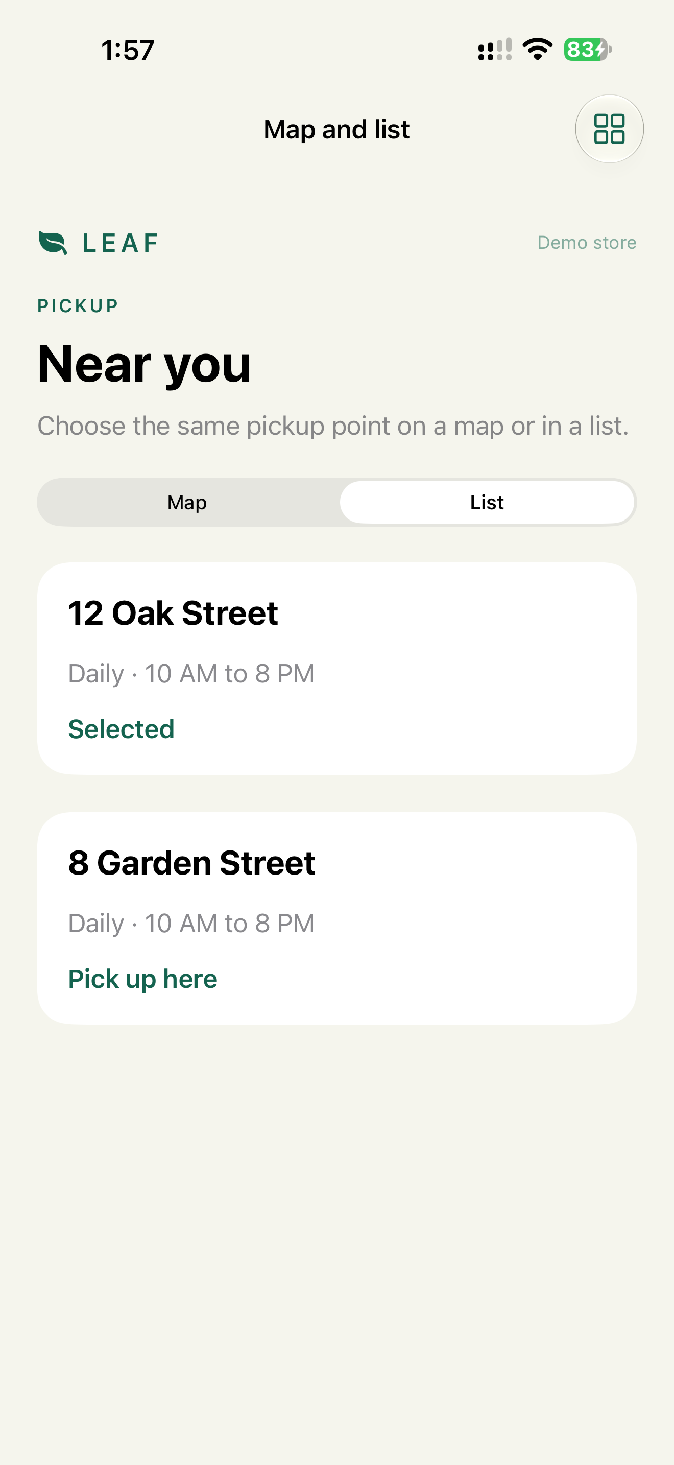
The visible text "Pick up here" isn't part of the label "Pick up at 8 Garden Street", so without the accessibilityInputLabels line "Tap Pick up here" wouldn't match. The demo has the line.
Check: choose a point with VoiceOver and with Switch Control without touching the map. Voice Control: "Tap Pick up here" shows a number for each point.
Catalog: Map Dead End, List Alternative.
Case 5: Media
Goal: learn how to brew tea from a 30-second video.
Breaks: no caption track. The caption control is a button whose title changes between "Captions on" and "Captions off", so the name changes with the state.
Fix: a caption track in the media (Chapter 8, Decision 1). If the app has its own caption control, it's a Toggle: the name stays the same, and the state goes in the value.
Toggle("Captions", isOn: $captionsOn)
Button("Read transcript") { showTranscript = true }
Check: Closed Captions + SDH on in Settings: captions appear without the in-app toggle. VoiceOver: "Captions, switch button, on". The transcript contains every fact from the video.
Catalog: Audio Only Task, Captioned Media.
Case 6: Onboarding
Goal: get through four intro pages, or skip them.
Breaks: a swipe-only carousel. No page indicator that VoiceOver can read, no Next, no Skip. Pages auto-advance every 5 seconds.
Fix:
TabView(selection: $page) { pages }
    .tabViewStyle(.page(indexDisplayMode: .always))

HStack {
    Button("Skip") { finish() }
    Spacer()
    Button(page == pages.count - 1 ? "Get started" : "Next") {
        if page == pages.count - 1 { finish() } else { page += 1 }
    }
}
The system page indicator in TabView(.page) is accessible: VoiceOver reads "Page 2 of 4, adjustable". Next and Skip give a non-swipe path. No auto-advance: it moves content while the user is still reading or the VoiceOver user is still listening (WCAG 2.2.2).
Check: complete onboarding with Switch Control and with Voice Control ("Tap Next"). With Reduce Motion on, page changes fade instead of slide.
Catalog: Swipe Trap, Gesture Alternative.
Case 7: Delivery date scroller
Goal: choose a delivery day.
Breaks: a horizontal date scroller at the very bottom of the screen. A drag along the bottom edge triggers Reachability or the Home gesture. Switch Control can't drag at all.
Fix: Previous/Next day buttons around the scroller, and the scroller kept above the system gesture area. Code and reasoning: Chapter 3, Decision 4.
Check: with Reachability on, dragging the scroller never pulls the screen down. Switch Control changes the date with the buttons.
Catalog: Edge Gesture Collision, System Gesture Safe Zone.
Writing your own case
Screen:   …
Goal:     what the user is trying to do
Breaks:   profile + what fails (transcript or screenshot)
Fix:      code
Check:    profile + expected output
Catalog:  smell → pattern
AI can draft the "Breaks" section from a screenshot and code:
For this screen, fill in: goal, likely failures per profile
(VoiceOver, AX5, Switch Control, Voice Control), probable code cause.
Include long localized strings and RTL where layout or order matters.
The draft is a list of hypotheses. "Check" is filled in on a device.
What we don't do
- We don't end a case with advice. Every case ends with a check.
- We don't use a placeholder as a field's only name.
- We don't put state in a button's title.
Related catalog entries
- Silent Error, Focus Black Hole: search and form failures.
- Map Dead End, List Alternative: spatial UI.
- Swipe Trap, Edge Gesture Collision: gestures.
- Disabled Mystery: blocked progress in real screens.
- Focus Recovery, State as Value, Gesture Alternative, System Gesture Safe Zone: the fixes used above.
Chapter takeaway
Goal, breaks, fix, check. A case study is finished when the check has an expected output.
Sources
- Apple Human Interface Guidelines: Accessibility
- Apple Human Interface Guidelines: Search fields
- Apple Human Interface Guidelines: Entering data
- Apple Human Interface Guidelines: Maps
- Apple Human Interface Guidelines: Playing video
- Apple Developer: TextField
- Apple Developer: SwiftUI accessibility modifiers
- W3C: Understanding SC 2.2.2 Pause, Stop, Hide
- iOS Access for All