6. Visual accessibility
Status: draft
Chapter goal
Users change how the screen looks: text gets bigger and bolder, contrast goes up, transparency and motion go down, color stops being a reliable signal. The design was made for one combination of these settings, and the app has to work with all of them. This chapter covers what breaks under each setting and the fix that holds.
The screen
The delivery card from the Leaf demo: a title, a two-line description, a Choose delivery button. At the default text size it fits well.

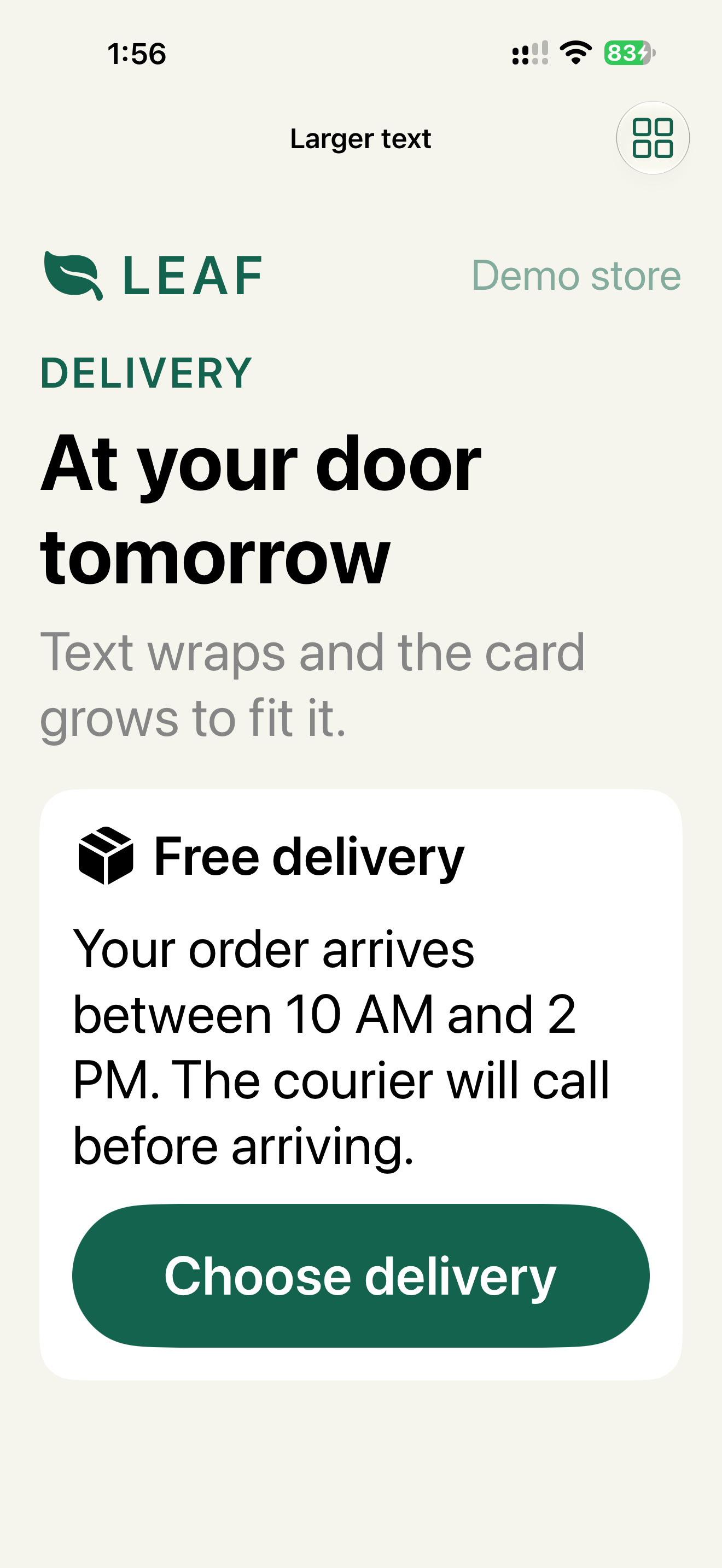
At Accessibility Large, body text is about twice the default size. The description wraps to five lines, and the card grows. That works only because the card has no fixed height.
What breaks
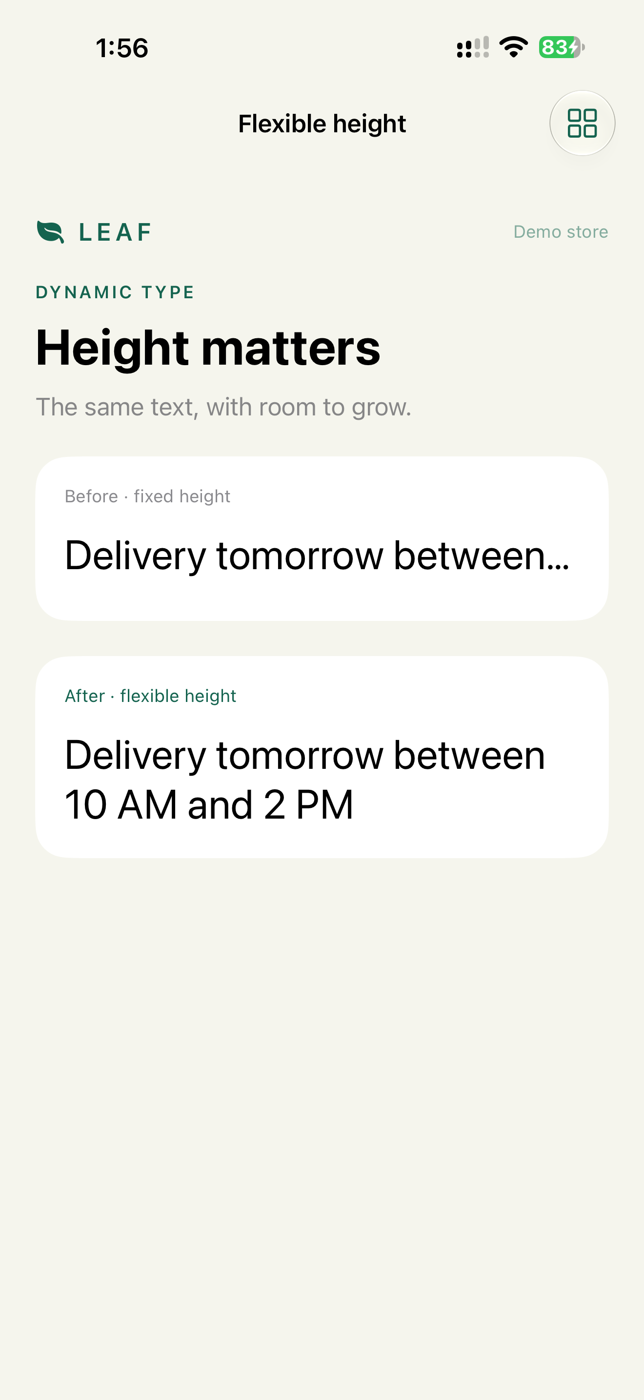
- Fixed height. The same text in a card with a fixed 42 pt height is cut off after one line. The user doesn't know there was more.
- Color-only error. The email field turns red. Nothing else changes.
- Animation-only confirmation. A checkmark flies into the cart. With Reduce Motion on, or if the user looked away, the confirmation is gone.
- Text on blur. A translucent toolbar over a product photo. With busy images, the text on it can't be read.
- Thin custom font. A 300-weight brand font at 15 pt that ignores Dynamic Type and Bold Text.
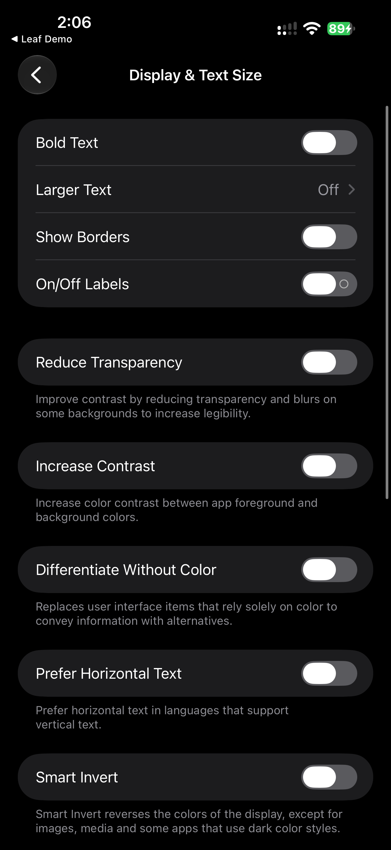
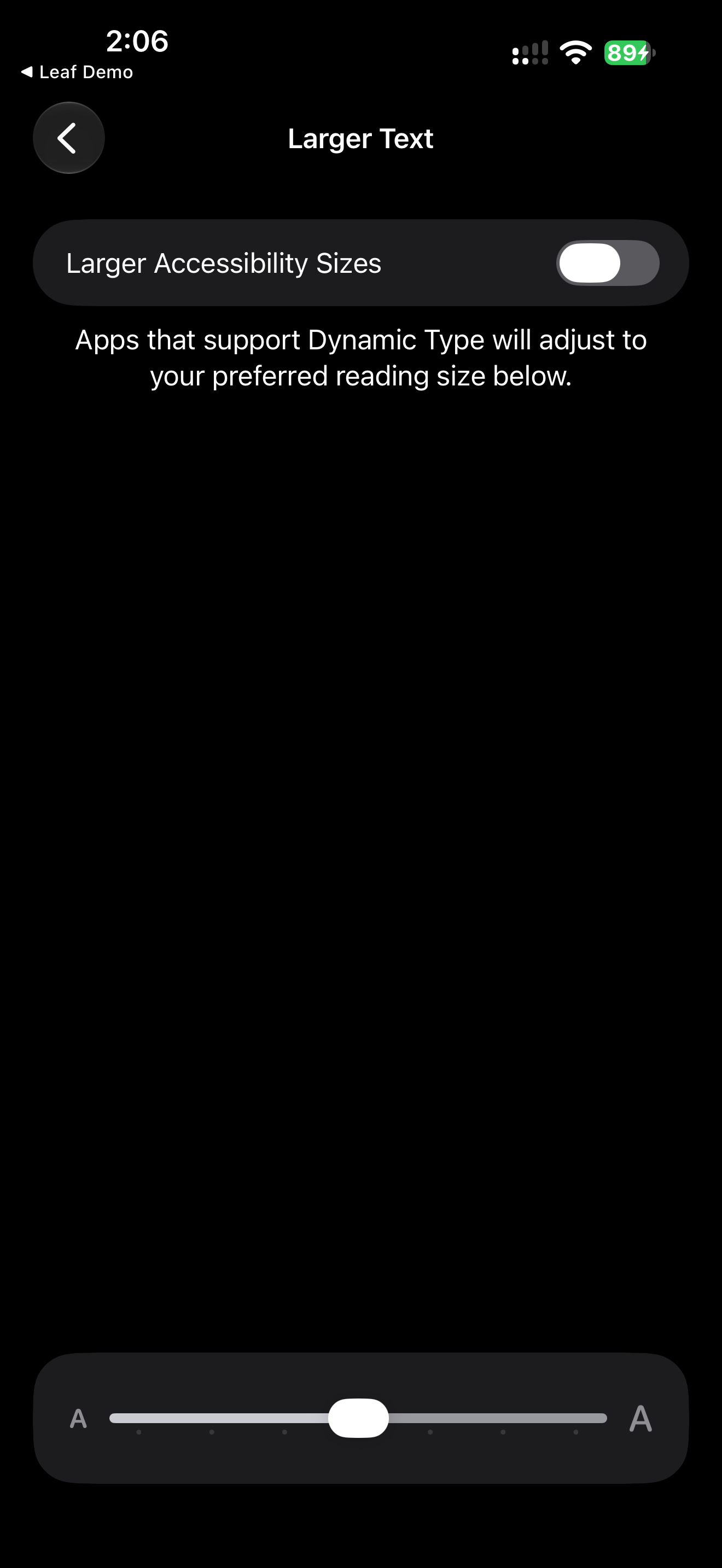
Where the settings are
Constraints
- No fixed heights on anything that contains text. Minimum heights are fine. Maximum heights are a bug.
- No custom font sizes outside Dynamic Type. Custom fonts are allowed if they scale.
- Color never carries a state alone. Not only when Differentiate Without Color is on. Always.
- Motion never carries meaning alone. Same rule.
Decision 1: Text grows, layout follows
Verdict: text styles everywhere, no fixed text heights, and a layout switch at accessibility sizes.
Text("Delivery tomorrow between 10 AM and 2 PM")
    .font(.title)
    .fixedSize(horizontal: false, vertical: true)
.fixedSize(horizontal: false, vertical: true) lets the text take all the height it needs inside containers that would otherwise compress it. The real fix is to remove .frame(height:) from the container. This is the demo's "after" version.
Custom fonts scale through relativeTo::
Text("Jasmine tea")
    .font(.custom("Leaf Serif", size: 22, relativeTo: .title2))
Icon sizes and paddings that should grow with text use @ScaledMetric:
@ScaledMetric(relativeTo: .body) private var iconSize = 20.0
UIKit:
titleLabel.font = UIFontMetrics(forTextStyle: .headline)
    .scaledFont(for: UIFont(name: "Leaf Serif", size: 17)!)
titleLabel.adjustsFontForContentSizeCategory = true
titleLabel.numberOfLines = 0
When the row is horizontal, switch to vertical at accessibility sizes (Chapter 2, Decision 1).
Check: Larger Text at the maximum size, on checkout and on every form. No "…" without a way to read the full text. The primary action can be reached by scrolling.
Decision 2: Color plus shape or text
Verdict: every color state also has an icon or text that is visible to everyone.
TextField("Email", text: $email)
    .overlay(RoundedRectangle(cornerRadius: 8).stroke(.red, lineWidth: 2))

Label("Enter a complete email: anna@example.com",
      systemImage: "exclamationmark.circle.fill")
    .foregroundStyle(.red)
Why: about 1 in 12 men and 1 in 200 women have some form of color vision deficiency. Red and green are the most common pair to confuse. A red border tells them nothing. The icon and the text work with any color vision. VoiceOver reads the text too, so the same fix covers it.
accessibilityDifferentiateWithoutColor is useful when a design really has no room for an extra signal, for example colored dots in a chart. Then the dots switch to shapes when the setting is on. For form errors and selection, the extra signal should always be there.
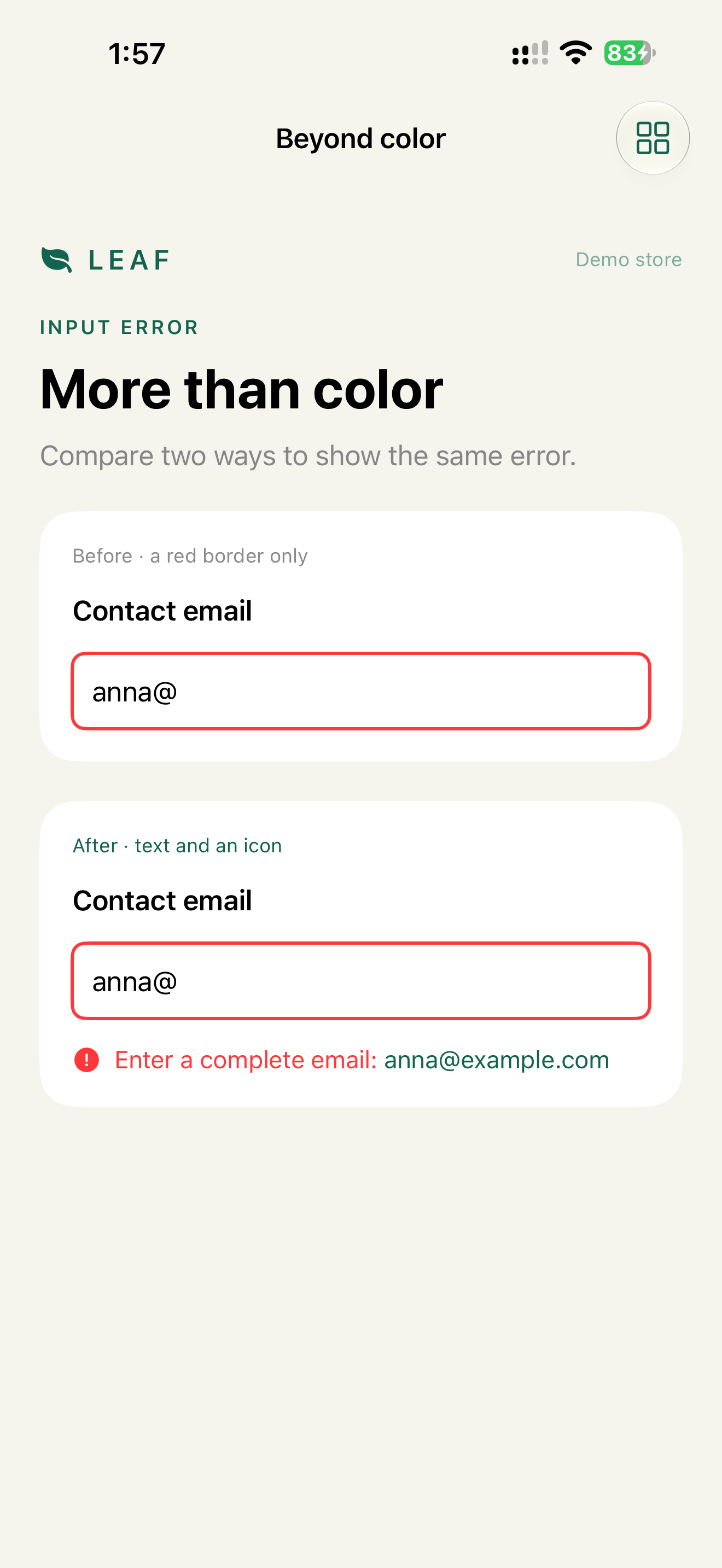
Check: Settings → Accessibility → Display & Text Size → Color Filters → Grayscale. Every state on the screen is still distinguishable.
Decision 3: Contrast and transparency follow the system
Verdict: system colors and materials by default. Custom colors get a High Contrast variant in the asset catalog.
Why: system colors like .primary, .secondary and Color(.separator) adjust to Increase Contrast automatically. Materials like .regularMaterial become solid with Reduce Transparency. Custom hex colors and custom blur don't. Each one is a manual check.
@Environment(\.colorSchemeContrast) private var contrast
@Environment(\.accessibilityReduceTransparency) private var reduceTransparency

toolbar
    .background(reduceTransparency ? AnyShapeStyle(Color(.systemBackground))
                                   : AnyShapeStyle(.regularMaterial))
    .overlay(alignment: .bottom) {
        Divider().opacity(contrast == .increased ? 1 : 0.5)
    }
A WCAG 2.2 AA minimum for text contrast is 4.5:1 for body text and 3:1 for large text and UI components. Check custom colors in both light and dark mode, with Increase Contrast on and off. That's four combinations.
Check: Accessibility Inspector → Color Contrast Calculator on custom colors. Increase Contrast and Reduce Transparency on: text over images stays readable.
Decision 4: Reduce Motion changes the animation, not the result
Verdict: the confirmation is a static state on screen for everyone. Reduce Motion replaces the movement with a fade or with nothing.
@Environment(\.accessibilityReduceMotion) private var reduceMotion

VStack {
    if transferComplete {
        Label("Transfer complete", systemImage: "checkmark.circle.fill")
            .transition(reduceMotion ? .opacity : .scale.combined(with: .opacity))
    }
}
.animation(.default, value: transferComplete)
Why: the common bug is if reduceMotion { Text("Done") } else { Animation() }. Then users without Reduce Motion get only the animation, and if they looked away, they never saw the result. The text should always be there. Only the transition changes.
Reduce Motion targets movement: zooms, slides, parallax, spinning. Fades are acceptable. Vestibular disorders are the main reason people turn it on. Large movement across the screen can cause dizziness and nausea.
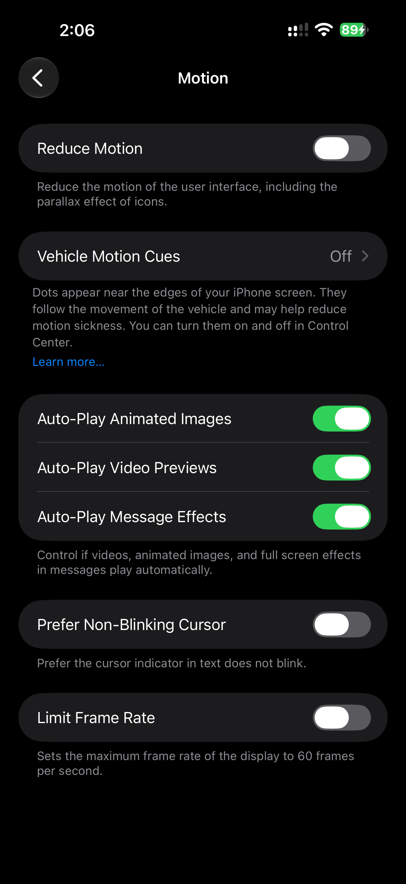
Check: with Reduce Motion on, nothing on screen moves across more than a small distance. With it on and off, the "Transfer complete" text is visible after the action.
Decision 5: Images stay images under Smart Invert
Verdict: photos, video and maps are excluded from inversion.
AsyncImage(url: product.photoURL)
    .accessibilityIgnoresInvertColors()
Why: Smart Invert inverts the UI but tries to leave media alone. Custom image views it can't detect get inverted, and a tea photo turns blue-green. UIKit: imageView.accessibilityIgnoresInvertColors = true.
Check: Smart Invert on, scroll the catalog. Product photos look normal.
Testing visual settings together
Settings combine. Larger Text with Bold Text and Increase Contrast is a common combination for low vision. The SwiftUI preview matrix in Chapter 10 covers several of them in one canvas.
AI can review screenshots, but only with context about what should be on screen:
Screenshot: checkout at accessibility3 text size, Bold Text on.
Expected visible: price, delivery address, error text, Pay button.
Report anything clipped, overlapping or missing.
A screenshot review doesn't show VoiceOver behavior. That needs the accessibility tree.
What we don't do
- We don't test only dark mode and call contrast done. Increase Contrast is a separate setting.
- We don't add an in-app font size slider. Dynamic Type already does this.
- We don't remove animations entirely under Reduce Motion when a fade keeps the meaning clearer.
Platform notes
- SwiftUI: text styles,
relativeTo:,@ScaledMetric,ViewThatFits,AnyLayout, environment values for each setting. - UIKit:
UIFontMetrics,adjustsFontForContentSizeCategory,numberOfLines = 0,traitCollection.preferredContentSizeCategory,UIAccessibilitystatus properties. - AppKit: no Dynamic Type in the iOS sense, but window resizing, focus rings and Increase Contrast apply. Chapter 12.
Related catalog entries
- Clipped Large Text: Dynamic Type breaks the layout.
- Color Only State: state exists only as color.
- Animation Only Feedback: the result exists only as motion.
- Dynamic Type Contract: rules for scalable text.
- State as Value: state beyond visual style.
Chapter takeaway
The design was made for one set of settings. The app has to work with all of them. No fixed text heights, no color-only states, no motion-only results.
Sources
- Apple Human Interface Guidelines: Accessibility
- Apple Human Interface Guidelines: Color
- Apple Human Interface Guidelines: Motion
- Apple Support: Use display and text size preferences
- Apple Support: Customize onscreen motion on iPhone
- Apple Support: Zoom in on the iPhone screen
- Apple Developer: DynamicTypeSize
- Apple Developer: ScaledMetric
- Apple Developer: UIFontMetrics
- W3C: Understanding SC 1.4.3 Contrast (Minimum)
- National Eye Institute: Color Blindness