4. Accessibility as part of UX
Status: draft
Chapter goal
Accessibility is not a layer of labels added after design. Every state a screen can be in — selected, empty, loading, error, disabled, modal, success — either tells the user what happened or leaves them guessing. This chapter goes through those seven states on one checkout flow and gives each one a fix and a check.
The screen
The running example is the Leaf demo store from demos/AccessibilityDemo: search for tea, pick a delivery address in a sheet, enter an email, pay.
Visually the flow is fine. With VoiceOver on, it breaks in five places:
- The selected address is marked only by color. VoiceOver reads all three addresses the same way.
- Search returns zero results. The screen changes, VoiceOver says nothing.
- Submit fails. The error text appears under the field, focus stays on the Continue button.
- The address sheet has no Cancel button. Swipe down is the only way out.
- The Pay button is grayed out. VoiceOver says "dimmed" and nothing else.
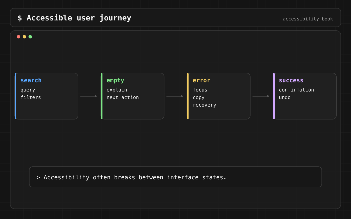
What every state must answer
Four questions. If a state doesn't answer them for a VoiceOver user, it's broken, no matter how it looks:
- Where am I?
- What changed?
- What can I do now?
- What happens next?
A sighted user answers them from color, motion and layout. A VoiceOver user gets only what is in the accessibility tree and what is spoken. Everything below is about closing that gap.
Constraints
- Native controls first. If a system control already exposes the state (trait, value, focus), we don't rebuild it by hand.
- No hardcoded state words. "Selected", "dimmed", "button" come from traits. The system localizes them. A string in
accessibilityValuedoesn't get localized unless you do it yourself. - Announcements are a last resort. Moving focus or updating a value is preferred. An announcement is gone after it's spoken, and a newer one can cut it off.
- Baseline is iOS 26.
AccessibilityNotificationrequires iOS 17,@AccessibilityFocusStaterequires iOS 15. Both are safe here.
State 1: Selected
Verdict: selection is a trait plus a visible non-color marker. Not a string in accessibilityValue.
Why: .isSelected makes VoiceOver say "selected" in the user's language. A checkmark covers Differentiate Without Color Alone. accessibilityValue("Selected") does neither: it is an English string for VoiceOver only, and nothing changes on screen.
Button {
    selected = address
} label: {
    HStack {
        Label(address, systemImage: "mappin")
        Spacer()
        if selected == address {
            Image(systemName: "checkmark")
        }
    }
}
.accessibilityAddTraits(selected == address ? .isSelected : [])
Check: VoiceOver reads "selected, 12 Oak Street, button". With color filters on, the checkmark is still visible.
State 2: Empty and changed results
Verdict: when the result count changes after the user stops typing, announce it once.
Why: results update in place, focus stays in the search field. Without an announcement, a VoiceOver user doesn't know whether the list has 40 items or zero. Announcing on every keystroke is the opposite problem: speech gets interrupted on each letter.
.task(id: query) {
    do {
        try await Task.sleep(for: .milliseconds(600))
    } catch {
        return // query changed, this task was cancelled
    }
    let message = results.isEmpty
        ? "No results. Try another search or clear filters."
        : "\(results.count) results"
    AccessibilityNotification.Announcement(message).post()
}
.task(id:) cancels the previous task when query changes, so the delay works as a debounce. The empty state itself stays on screen as text with a Clear filters button. The announcement only points at it.
Check: type "jasmine oolong" letter by letter. VoiceOver says "No results…" once, after the last letter.
State 3: Error
Verdict: after a failed submit, move VoiceOver focus to the error text. The user starts from the problem, not from the Continue button they just pressed.
This is the code from the demo:
@AccessibilityFocusState private var errorFocused: Bool

if errorVisible {
    Label("Enter a house number. For example: 12 Oak Street.",
          systemImage: "exclamationmark.circle.fill")
        .foregroundStyle(.red)
        .accessibilityFocused($errorFocused)
}

Button("Continue") {
    errorVisible = !address.contains(where: \.isNumber)
    if errorVisible { errorFocused = true } else { submit() }
}
Three details:
- The error text says what to do, not just what is wrong. "Enter a house number" instead of "Invalid address".
- The icon and text duplicate the red color. Red alone fails for color-blind users and for Differentiate Without Color Alone.
@AccessibilityFocusStatemoves the focus of assistive technologies such as VoiceOver. Keyboard focus is a different system,@FocusState. If keyboard users must land on the field too, set both.
If focus doesn't move, the usual reason is that the error view wasn't in the accessibility tree yet when focus was set. Set the focus after the view appears, for example in .onAppear of the error label.
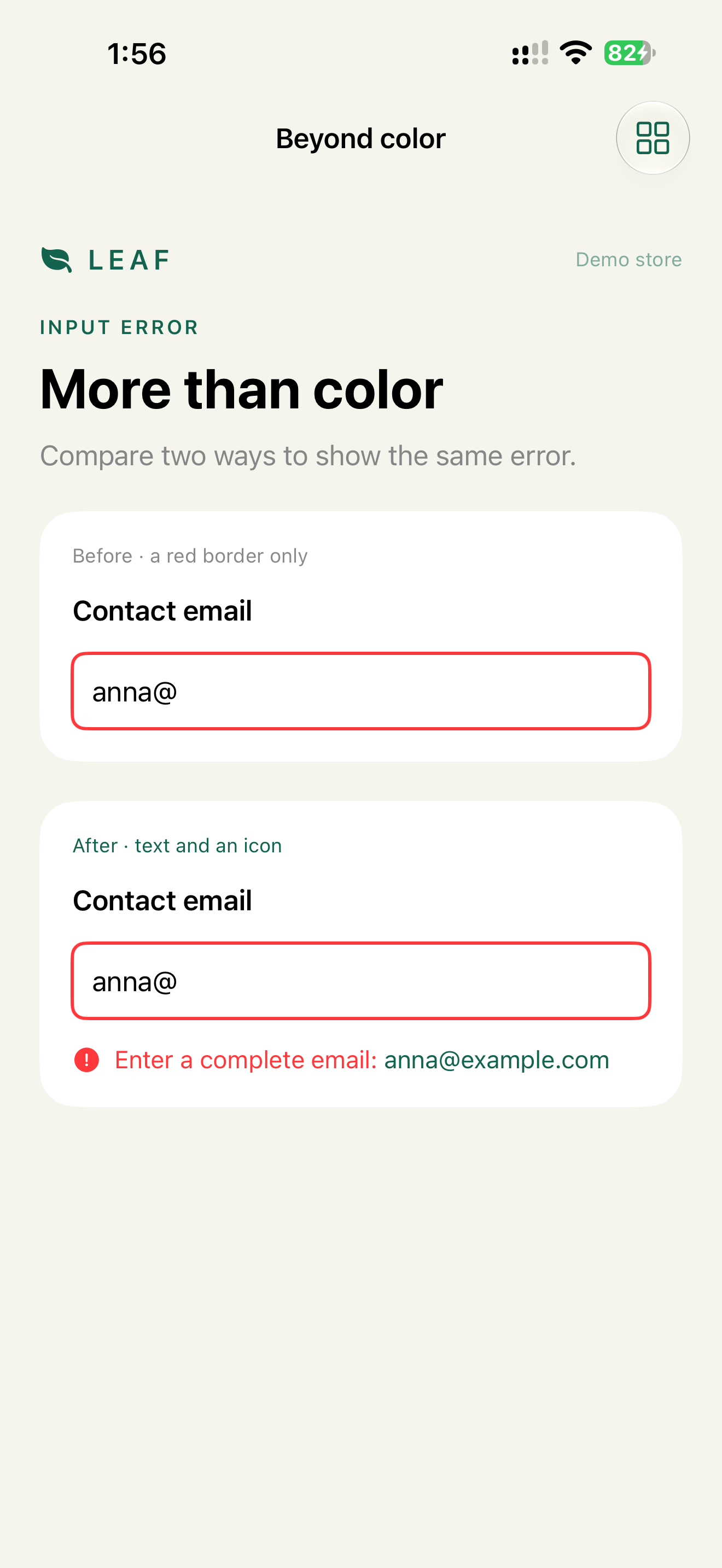
Check: submit with "Oak Street". VoiceOver immediately reads "Enter a house number. For example: 12 Oak Street." Typed text stays in the field.
State 4: Modal
Verdict: a sheet needs three things: focus goes in, there is a visible way out, and focus comes back to the control that opened it.
Why each one:
- Focus in. A SwiftUI
.sheetand UIKitpresent(_:animated:)move VoiceOver focus into the sheet on their own. ManualUIAccessibility.post(notification: .screenChanged, argument:)is needed only for custom overlays that are not presented through the system. - Way out. Swipe down is a gesture. Switch Control and Voice Control users need a button. A Cancel button also gives Voice Control a name: "Tap Cancel". VoiceOver also has the two-finger scrub, the Z-shaped escape gesture, but a visible button works for everyone.
- Focus back. After the sheet closes, VoiceOver focus often lands at the top of the screen. The user loses their place. In the demo we don't rely on the system and set focus explicitly.
@AccessibilityFocusState private var addressFocused: Bool

Button { sheet = true } label: {
    HStack { Text(selected); Spacer(); Image(systemName: "chevron.right") }
}
.accessibilityFocused($addressFocused)
.sheet(isPresented: $sheet, onDismiss: { addressFocused = true }) {
    NavigationStack {
        AddressList(selected: $selected, sheet: $sheet)
            .navigationTitle("Delivery address")
            .toolbar {
                ToolbarItem(placement: .cancellationAction) {
                    Button("Cancel") { sheet = false }
                }
            }
    }
}
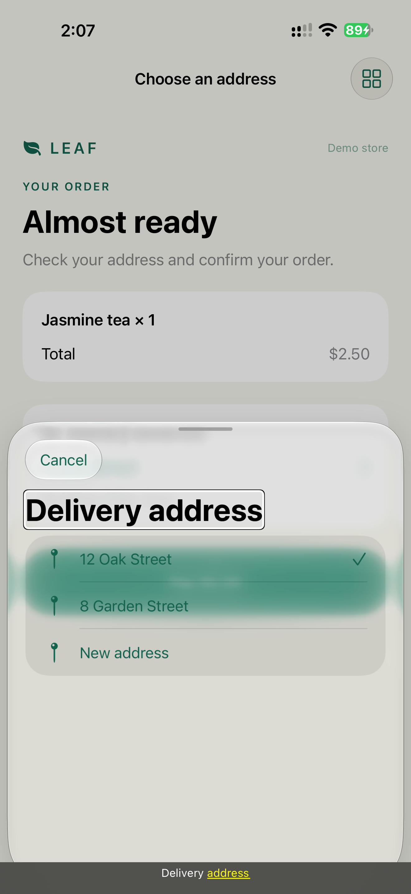
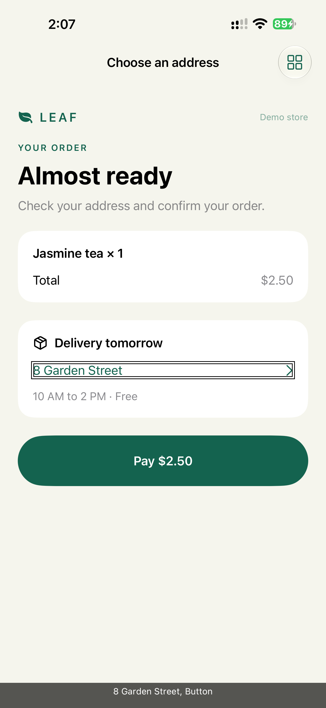
These two captures were made on iOS 27.0.1, one version above the book baseline. The APIs used here behave the same on iOS 26.
Check: the focus-transition transcript records actual VoiceOver speech. Expected sequence: "Delivery address, heading" inside the sheet, then "8 Garden Street, button" after it closes. The UI test reads speech without moving focus manually, so it can't repair a bug by accident.
State 5: Disabled
Verdict: for form validation, keep the button enabled and validate on tap. Disable it only when tapping would be unsafe or impossible, and then say why.
Why: a disabled button hides the rule. A sighted user guesses from gray color and nearby empty fields. A VoiceOver user hears "Pay, dimmed, button" and has nothing to fix. An enabled button with validation leads straight to State 3: focus on the error, with an instruction.
When disabling is justified, for example while the card is being verified, the reason goes both on screen and into the element:
Button("Pay $2.50") { pay() }
    .disabled(isVerifyingCard)
    .accessibilityValue(isVerifyingCard ? "Verifying card" : "")

if isVerifyingCard {
    Text("Verifying card. This takes up to 10 seconds.")
}
The trait already says "dimmed". The value adds why. Details: Disabled State Explanation.
Check: VoiceOver reads the label, "Verifying card" and "dimmed". The same reason is visible under the button.
State 6: Loading
Verdict: one spoken loading element. The skeleton is hidden from accessibility.
Why: placeholder rows exposed as content sound like real data. VoiceOver reads 10 empty rows, the user swipes through all of them, then the list reloads and focus is lost.
ProgressView("Loading orders")

SkeletonOrdersList()
    .accessibilityHidden(true)
Check: on Network Link Conditioner "Very Bad Network", VoiceOver finds "Loading orders" once and no placeholder rows. Details: Loading State Contract.
State 7: Success
Verdict: the result stays on screen. The announcement and the haptic are extras.
Why: an announcement is spoken once and gone. If VoiceOver was reading something else, or the user had speech muted, the confirmation is lost. A persistent "Paid · Order 42" screen can be found again. A toast that disappears after 2 seconds can't.
AccessibilityNotification.Announcement("Payment complete. Order 42 is confirmed.").post()
UINotificationFeedbackGenerator().notificationOccurred(.success)
The demo success screen also has a "Repeat confirmation" button. It replays the announcement for users who missed it.
Check: turn VoiceOver off and the sound off, then pay. The order number is still readable on screen.
What we don't do
- We don't announce every state change. Selected, disabled and loading are covered by traits and values. They are read when the user reaches the element.
- We don't move focus while the user is typing. The search field keeps focus, results are announced.
- We don't use toast as the only feedback for anything the user needs later.
Team checklist
For each screen, list the seven states and write the expected VoiceOver output for each one before implementation. Example for the address picker:
Selected:  "selected, 12 Oak Street, button"
Modal in:  "Delivery address, heading"
Modal out: "8 Garden Street, button"
If a state has no expected output, it hasn't been designed.
AI can help build the inventory, but it doesn't verify anything:
List loading, empty, error, selected, disabled, modal and success states
for this checkout flow. For each, write the expected VoiceOver output
and one Dynamic Type risk.
The list is a starting point. The check is a device with VoiceOver on.
Platform notes
- SwiftUI: traits via
accessibilityAddTraits, focus via@AccessibilityFocusState, announcements viaAccessibilityNotification. - UIKit:
.screenChangedfor a new context,.layoutChangedfor part of a screen,.announcementfor a result without a focus target. Chapter 11 has the details. - AppKit: the same states exist. Keyboard focus is the primary path, so a modal must also return keyboard focus. Chapter 12.
Related catalog entries
- Silent Error: error exists, recovery does not start.
- Focus Black Hole: focus lost after a modal or update.
- Disabled Mystery: progress blocked without explanation.
- Skeleton Noise: placeholders read as content.
- Focus Recovery: fix for errors, modals and updates.
- Loading State Contract: loading without fake content.
- Disabled State Explanation: when to disable and how to explain it.
Chapter takeaway
If the user can't tell what changed or how to recover, the state is not designed. For each state, write the expected VoiceOver output first, then check it on a device.
Sources
- Apple Human Interface Guidelines: Accessibility
- Apple Human Interface Guidelines: Color
- Apple Developer: AccessibilityFocusState
- Apple Developer: AccessibilityNotification
- Apple Developer: UIAccessibility.Notification
- Apple Developer: AccessibilityTraits.isSelected
- Just Eat Takeaway Tech: Empowering Everyone