2. Accessibility map of iOS/iPadOS 26
Status: draft
Chapter goal
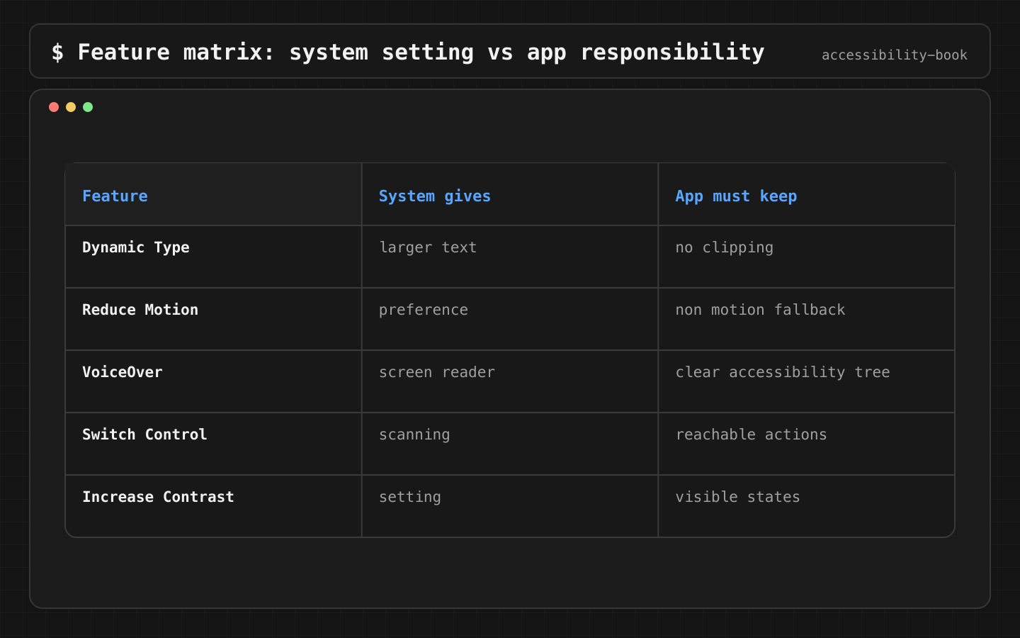
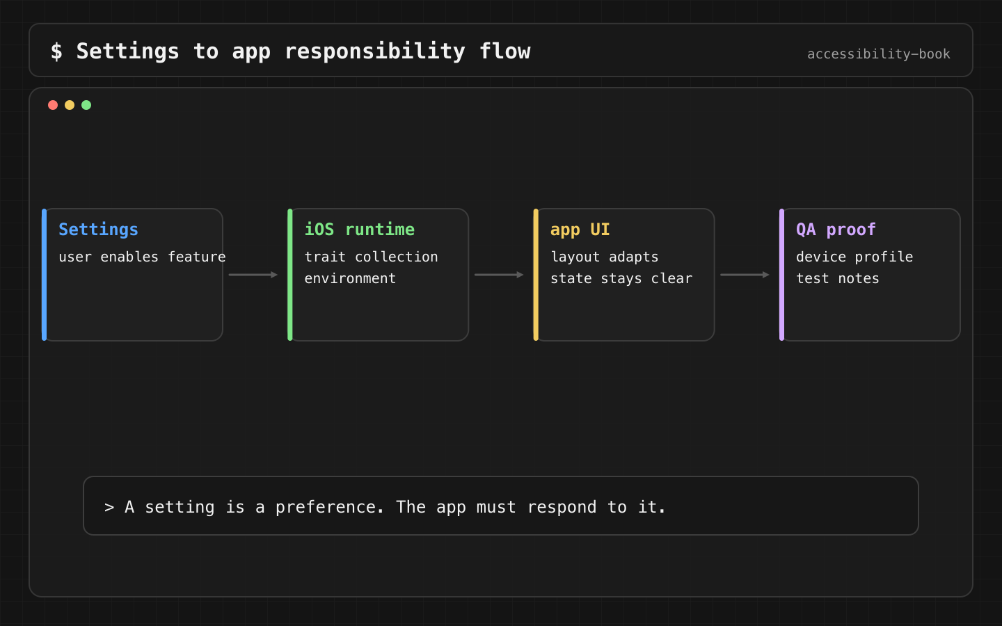
A user arrives at the app with their settings already on: Larger Text, Reduce Motion, Voice Control, captions. The app doesn't get to ask for a separate in-app setting before it becomes usable. This chapter maps the system settings to what the app has to do for each one and how to check it in code review.
What already exists
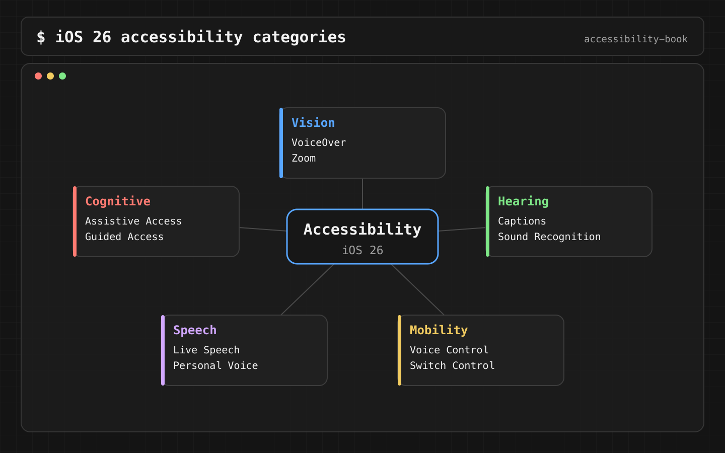
Apple groups accessibility features into five categories: Vision, Mobility, Hearing, Speech, Cognitive (iPhone User Guide, iOS 26). For a user this is a settings menu. For a developer it's runtime input, like locale or dark mode.
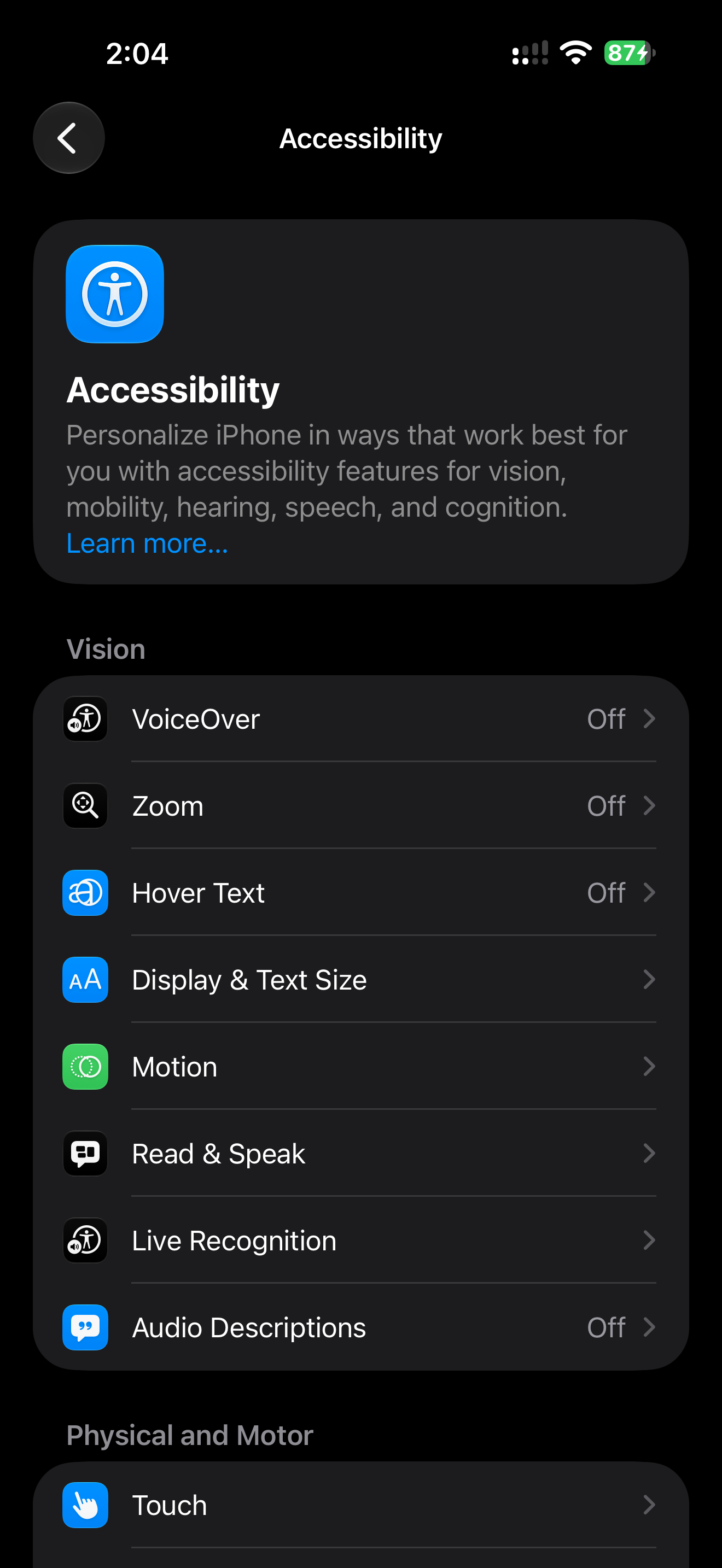
Settings screenshots in this book were captured on iOS 27.0.1, one version above the baseline. The category layout is the same in iOS 26.
What goes wrong
The app is tested with default settings, so the user's settings are never exercised. The typical results:
- Larger Text clips the price and pushes Pay off screen (Clipped Large Text).
- Reduce Motion removes an animation, and with it the only sign that the item was added (Animation Only Feedback).
- The selected filter is shown only by color (Color Only State).
- VoiceOver gets tested, Dynamic Type doesn't, or the other way around.
The map
What the app reads, what it must do, how to check. SwiftUI environment values are listed first, then the UIKit equivalent.
| Setting | App reads | App must | Check |
|---|---|---|---|
| Larger Text | \.dynamicTypeSize; UIFontMetrics, adjustsFontForContentSizeCategory |
Scale text, reflow layout, keep actions reachable | Critical flow at .accessibility5 |
| Bold Text | \.legibilityWeight; UIAccessibility.isBoldTextEnabled |
Custom fonts switch to a heavier weight | Custom font screens with Bold Text on |
| Increase Contrast | \.colorSchemeContrast; UIAccessibility.isDarkerSystemColorsEnabled |
Use system colors or High Contrast asset variants | Borders and secondary text still visible |
| Differentiate Without Color Alone | \.accessibilityDifferentiateWithoutColor; UIAccessibility.shouldDifferentiateWithoutColor |
Add a shape, icon or text to color states. Better: always have them | Grayscale color filter on the screen |
| Reduce Motion | \.accessibilityReduceMotion; UIAccessibility.isReduceMotionEnabled |
Replace movement with a fade or a static state. Keep the meaning | Every animated confirmation still has a static result |
| Reduce Transparency | \.accessibilityReduceTransparency; UIAccessibility.isReduceTransparencyEnabled |
Solid backgrounds behind text and controls | Text over blur stays readable |
| Smart Invert | accessibilityIgnoresInvertColors() |
Photos, video and maps are not inverted | Product photos look normal |
| VoiceOver | Semantics: label, value, traits, order | Correct accessibility tree. Don't branch UI on isVoiceOverRunning |
Main flow with the screen off (Screen Curtain) |
| Switch Control | Same semantics, focusable elements | Every action reachable without gestures | Main flow with Switch Control, point scanning off |
| Voice Control | Visible names, accessibilityInputLabels |
Names match visible text and are unique on screen | "Show names", then say each action |
| Subtitles & Captioning | AVPlayerViewController handles it; MACaptionAppearance for custom players |
Captions available and styled by the system | Video with captions on, custom style applied |
| Assistive Access | Dedicated app experience (Chapter 9) | Core tasks in a simplified layout | Main task in Assistive Access mode |
Details for each row are in Chapters 5–9.
Constraints
- We don't add in-app duplicates of system settings. A separate "large font" toggle in the app conflicts with Dynamic Type. The user already made that choice in Settings.
- We don't branch UI on "is VoiceOver running" without a strong reason. The same screen has to work with VoiceOver, Switch Control and Voice Control. A VoiceOver-only branch gets tested less and breaks first.
- Simulator doesn't replace a device. Accessibility Inspector and previews cover Dynamic Type, contrast and the accessibility tree. VoiceOver speech, haptics, Voice Control and Switch Control with real switches need a device.
Decision 1: Settings are inputs to the view
Verdict: read settings from the environment and design each state for them. Don't treat them as QA edge cases.
@Environment(\.dynamicTypeSize) private var typeSize
@Environment(\.accessibilityReduceMotion) private var reduceMotion

var body: some View {
    let layout = typeSize.isAccessibilitySize
        ? AnyLayout(VStackLayout(alignment: .leading))
        : AnyLayout(HStackLayout())

    layout {
        price
        addToCartButton
    }
}
Why: at accessibility sizes, price and button don't fit side by side. Switching to a vertical layout at isAccessibilitySize is cheaper than fixing clipping case by case.
Check: preview at .large and at .accessibility3. Both show the full price and the full button text.
Decision 2: Dynamic Type is checked on critical flows
Verdict: checkout, login, forms and support get a large-text preview. The profile screen alone doesn't count.
#Preview("Checkout, accessibility size") {
    CheckoutView(order: .sampleLongNames)
        .dynamicTypeSize(.accessibility3)
}
Why: Dynamic Type bugs show up where layout is dense and text is long: prices, addresses, errors, localized buttons. A settings screen is mostly short rows, so it rarely fails.
The sample data matters. "Tea" at AX3 fits. "Jasmine Dragon Pearl, 100 g gift tin" doesn't.
Check: at AX3, the primary action is reachable by scrolling, nothing is truncated with "…" without a way to read it, and errors are fully visible.
Decision 3: Motion never carries meaning alone
Verdict: the static result is always on screen. Animation is decoration on top. Reduce Motion only changes how the result appears.
@Environment(\.accessibilityReduceMotion) private var reduceMotion

cartBadge
    .contentTransition(.numericText())
    .animation(reduceMotion ? nil : .spring, value: cartCount)

Text(inCart ? "Added to cart" : "")
Why: if the "Added to cart" text appears only when Reduce Motion is on, users without the setting depend on the animation to see the result. Users who look away or have cognitive load miss it. The static text is for everyone. Reduce Motion only turns off the spring.
VoiceOver users get the result through the button value or an announcement (Chapter 5).
Check: with Reduce Motion on and off, the cart count and "Added to cart" are visible after the tap.
Legal context, briefly
Some products have legal requirements: ADA Title II for US state and local government apps, the European Accessibility Act and EN 301 549 for covered services in the EU. WCAG and EN 301 549 name classes of requirements. The table above shows how to check them in a native app. Details and limits: Legal context without legal theater.
A compliance document doesn't prove the app works. That only comes from evidence on real tasks (Compliance Theater).
Team checklist
Pick one critical flow. Fill in the map table for it: setting, app risk, check, owner. Where AI fits:
Map this checkout flow to Vision, Mobility, Hearing, Speech and Cognitive.
For each: likely app risk, manual check, code area.
AI produces a draft quickly. Each row still needs a device check before it counts.
What we don't do
- We don't test only one setting per release. Larger Text + Bold Text + Increase Contrast is a common combination and has to work together.
- We don't use custom font sizes that ignore Dynamic Type.
Platform notes
- SwiftUI: environment values plus previews are the cheapest early check.
- UIKit:
UIFontMetrics, Auto Layout, system colors,UIAccessibilitystatus properties and their change notifications. - AppKit: a different set of settings, keyboard-first. Chapter 12.
Related catalog entries
- Clipped Large Text: system text size breaks the task.
- Animation Only Feedback: Reduce Motion removes the only signal.
- Color Only State: state shown by color alone.
- Dynamic Type Contract: system text size as an implementation contract.
- State as Value: state exposed as value, not color.
Chapter takeaway
The user's settings are input, like locale. Every row in the map has a check. A row without a check hasn't been tested.