3. How users interact with iPhone
Status: draft
Chapter goal
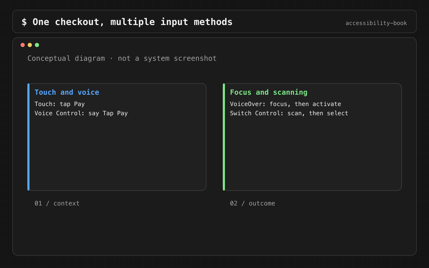
One task, several ways to do it: touch, VoiceOver, Voice Control, Switch Control, a hardware keyboard, a pointer. The app doesn't choose the input method, the user does. This chapter shows what each method needs from the app, and why one native control covers most of them at once.
The task
Leaf demo store: reorder a past purchase and pay. The same task, done six ways:
| Method | How the user acts | What the app must expose |
|---|---|---|
| Touch | Taps Reorder, then Pay | A visible target of at least 44 × 44 pt |
| VoiceOver | Swipes to an element, double-taps | Label, traits, order, actions |
| Voice Control | Says "Tap Reorder" | A visible name that matches the accessible name and is unique on screen |
| Switch Control | Waits for the scanner to highlight an item, presses a switch | Focusable elements and actions without gestures |
| Full Keyboard Access | Tab and arrow keys, Space to activate | Focusable controls in a logical order |
| Pointer (AssistiveTouch, trackpad, mouse) | Moves a cursor, clicks | Hit areas that match what's visible |
Larger Text isn't an input method, but it changes the same path: the Pay button has to stay reachable when the text is four times bigger.
What goes wrong
A visual design only describes the touch path. All the others get whatever the code happens to produce:
- Reorder is a
TextwithonTapGesture. VoiceOver reads it as text, Full Keyboard Access can't focus it. - Remove item exists only as a swipe. Switch Control and Voice Control users have no way to do it (Swipe Trap).
- Three buttons named "Edit". Voice Control shows numbers instead of names (Duplicate Voice Command).
- An icon without a name. VoiceOver says "button", Voice Control has nothing to call it (Mystery Icon).
- A date scroller dragged along the bottom edge triggers Reachability or the Home gesture (Edge Gesture Collision).
Constraints
- Native controls first.
Button,Toggle,TextField,Pickeralready work with every method in the table. A custom control has to be taught to each one separately. - Every gesture needs a non-gesture path. Swipe, drag, pinch and long press are shortcuts. The action itself has to be available as a button or an accessibility action.
- We don't build separate UI per input method. One screen, one accessibility tree. Separate branches get tested less and break first.
Decision 1: Interactive means a real control
Verdict: anything you can tap is a Button (or another native control), not a view with a tap gesture.
// Before
Text("Reorder")
    .onTapGesture { reorder() }

// After
Button("Reorder") { reorder() }
Why: one change fixes four methods. VoiceOver gets the button trait. Full Keyboard Access and Switch Control get a focusable target. Voice Control gets a name to say. UI tests can find it with app.buttons["Reorder"].
Check: Accessibility Inspector shows the element with the Button trait. Full Keyboard Access reaches it with Tab.
Decision 2: A card is one description plus visible actions
Verdict: combine the description into one element. Keep the action as its own button.
Code from the demo's order history:
VStack(alignment: .leading) {
    Text("Order No. \(number)")
    Text("November 12 · $7.50")
    Label("Delivered", systemImage: "checkmark.circle.fill")
}
.accessibilityElement(children: .combine)

Button("Reorder") { reorder(number) }
    .accessibilityLabel("Reorder \(number)")
Why: without grouping, the card is four or five stops for VoiceOver and Switch Control. With the button inside the group, Reorder can't be seen or named. Two elements is the minimum that keeps both.
Details and the trade-off between grouping and noise: Chapter 5, Right Sized Grouping.
Check: VoiceOver: "Order No. 42, November 12 · $7.50, Delivered", then "Reorder 42, button". Switch Control: two stops per card.
Decision 3: Names people can say
Verdict: repeated actions carry their context in the visible text.
Before:  Edit · Edit · Edit
After:   Edit address · Edit payment · Edit time
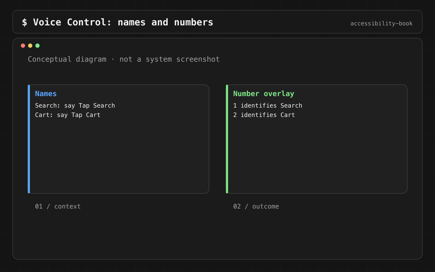
Why: Voice Control finds controls by name. Three "Edit" buttons force the user to say "Show numbers" and then a number, two steps instead of one. VoiceOver users hear "Edit, button" three times with no context. Clear names also help users with cognitive disabilities.
The demo screen "Unique button names" uses exactly this.
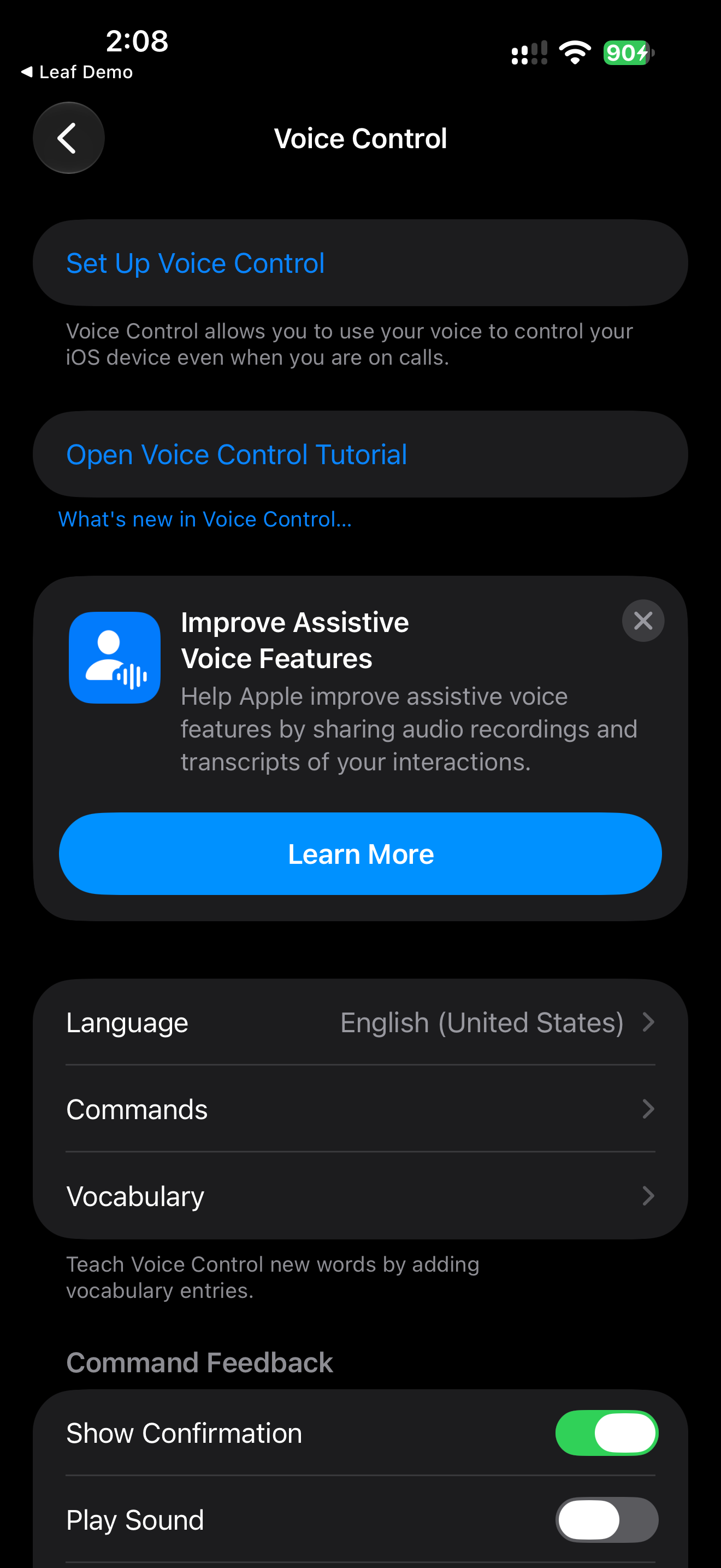
Check: Voice Control → "Show names". Each label on screen is different, and "Tap Edit payment" works on the first try.
Decision 4: Gestures are shortcuts, not the only path
Verdict: every swipe or drag has a button or an accessibility action that does the same thing.
OrderRow(order)
    .gesture(swipeToDelete(order))                     // custom drag, invisible to VoiceOver
    .accessibilityAction(named: "Delete") { delete(order) }
For a horizontal date scroller, the alternative is Previous and Next buttons next to it:
HStack {
    Button("Previous day", systemImage: "chevron.left") { date.previousDay() }
    DateScroller(selection: $date)
    Button("Next day", systemImage: "chevron.right") { date.nextDay() }
}
.labelStyle(.iconOnly)
.safeAreaPadding(.bottom)
Why: a swipe needs precise finger movement. Switch Control, Voice Control and AssistiveTouch users may not be able to do it at all. The bottom edge of the screen also belongs to the system: Home indicator and Reachability use it. A drag control placed there competes with system gestures. safeAreaPadding moves it above the Home indicator area.
swipeActions in a SwiftUI List is already exposed to VoiceOver as actions, so it doesn't need an extra accessibilityAction: adding one lists "Delete" twice. A custom drag gesture is not exposed, which is why the explicit action is there.
Check: Switch Control can delete an order and change the date without any gesture. With Reachability on, dragging the date scroller doesn't pull the screen down.
Decision 5: Order follows the task, for every method
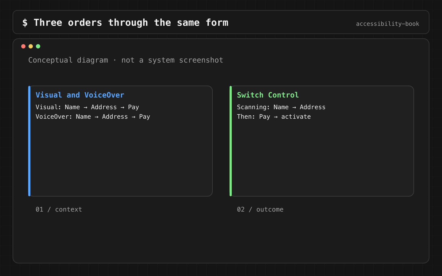
Verdict: VoiceOver order, Switch Control scanning order and keyboard Tab order all follow the task: name, address, Pay.
Why: all three follow the accessibility tree and layout, not the visual design. If the tree order is wrong, it's wrong for all three at once. If it's fixed, it's fixed for all three.
Details: Chapter 5 (Decision 5), Reading Order Contract.
Check: walk the flow with VoiceOver, then with Switch Control item scanning, then with Tab on a keyboard. All three reach Pay last.
Mapping a flow
For each critical flow, write the path for each method before testing:
Task: reorder and pay
Touch:          Reorder 42 → Pay $7.50
VoiceOver:      "Order No. 42…" → "Reorder 42, button" → … → "Pay $7.50, button"
Voice Control:  "Tap Reorder 42" → "Tap Pay"
Switch Control: scan to card → select Reorder → scan to Pay → select
Keyboard:       Tab ×N → Space → Tab ×M → Space
If a line can't be written, the path doesn't exist. AI can draft this map from a screenshot and code:
For this screen, write the step-by-step path for touch, VoiceOver,
Voice Control, Switch Control and Full Keyboard Access.
Mark every step that depends on a gesture or on sight.
The marked steps are the blockers. Each one still needs to be confirmed on a device.
What we don't do
- We don't test only touch and VoiceOver. Voice Control and Switch Control break in different places: names and gestures.
- We don't put primary drag controls on the bottom edge.
- We don't hide primary actions in custom actions. They have to be visible.
Platform notes
- SwiftUI: native controls, then modifiers.
accessibilityAction(named:)for gesture alternatives. - UIKit:
isAccessibilityElement,accessibilityTraits,accessibilityCustomActions,accessibilityElementsfor order. Chapter 11. - AppKit: keyboard focus and menu commands are the primary path. Chapter 12.
Related catalog entries
- Mystery Icon: a control without a name.
- Swipe Trap: an action that exists only as a gesture.
- Duplicate Voice Command: several controls with the same name.
- Edge Gesture Collision: app gesture conflicts with a system gesture.
- Semantic Control: a real control instead of a gesture.
- Gesture Alternative: a non-gesture path.
- System Gesture Safe Zone: keep drag controls off system edges.
- Icon Button Label: a name for every icon.
- Reading Order Contract: one task order for all methods.
- Guides: VoiceOver gestures, Switch Control scanning, Voice Control label audit.
Chapter takeaway
Touch is one of six paths. A native control with a clear name covers most of the others. Every gesture needs a second path.
Sources
- Apple Support: Use VoiceOver in apps on iPhone
- Apple Support: Accessibility features for mobility on iPhone
- Apple Support: Use Voice Control commands to interact with iPhone
- Apple Support: Intro to Switch Control on iPhone
- Apple Support: Use Switch Control on iPhone to select items and perform actions
- Apple Support: Reach the top of the iPhone screen with one hand
- Apple Developer: SwiftUI accessibility modifiers
- Apple Developer: Accessibility for UIKit
- Apple Human Interface Guidelines: Gestures
- Apple Human Interface Guidelines: Layout