Accessible Card
Status: ready
Intent
A dense card reads as one object with its state and its actions, not as a pile of subviews.
Problem
A typical card has an image, a title, a subtitle, a badge, a price, a status and one or two buttons. Visually it's compact. VoiceOver reads every subview as a separate stop, and the task gets lost between them.
Solution
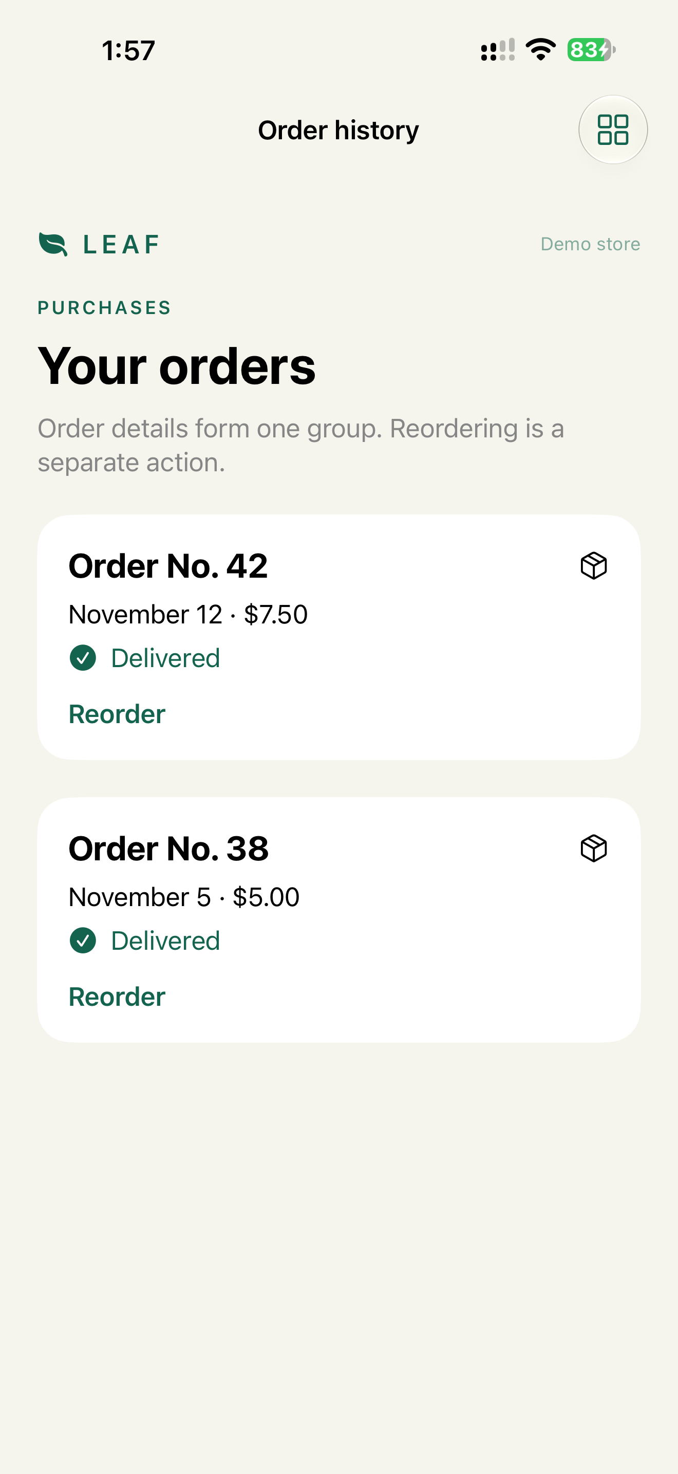
Verdict: the card's information is one element: the object name as the label, changing state as the value. The primary action stays a real button with the object in its name. Secondary actions can be accessibility actions.
Why: one swipe gives the whole summary. The primary action stays visible to Voice Control and Switch Control. A secondary action doesn't add a stop per card.
Use this when the card is one object in the user's mind: an order, a product, a transaction, an appointment, a playlist item.
Implementation
SwiftUI, summary + primary action:
VStack(alignment: .leading) {
    VStack(alignment: .leading) {
        Text("Order \(order.number)")
        Text(order.status)
        Text(order.total)
    }
    .accessibilityElement(children: .combine)

    Button("Reorder") { reorder(order) }
        .accessibilityLabel("Reorder order \(order.number)")
        .accessibilityInputLabels(["Reorder", "Reorder order \(order.number)"])
}
Order 1042, Delivered, $24.80
Reorder order 1042, button
SwiftUI, summary + secondary action, one stop:
OrderCard(order)
    .accessibilityElement(children: .ignore)
    .accessibilityLabel("Order \(order.number)")
    .accessibilityValue("\(order.status), \(order.total)")
    .accessibilityAction(named: "Reorder") { reorder(order) }
Order 1042, Delivered, $24.80, Actions available
UIKit:
cell.isAccessibilityElement = true
cell.accessibilityLabel = "Order \(order.number)"
cell.accessibilityValue = "\(order.status), \(order.total)"
cell.accessibilityCustomActions = [
    UIAccessibilityCustomAction(name: "Reorder") { _ in
        reorder(order)
        return true
    }
]
Add .button to the traits only if tapping the whole cell does something, like opening details.
A selectable card, like a payment method, is a button with a selected trait:
Button { select(card) } label: { PaymentCardRow(card) }
    .accessibilityLabel("Visa ending in 4242")
    .accessibilityAddTraits(card.isSelected ? .isSelected : [])
Check
Profile:   VoiceOver
Task:      find order 1042 and reorder it
Expected:  the summary is one stop
           no decorative image is a stop
           Reorder is reachable and names the order
Profile:   Switch Control
Task:      scan a list of 10 orders
Expected:  one stop per summary, one per primary action
           the primary action isn't only in custom actions
Pitfalls
- Grouping a card that contains toggles, fields, steppers or payment choices. Those stay separate (Over Grouped Control).
- A label that's a paragraph.
- Changing state in the label instead of the value.
- A destructive action hidden behind a vague custom action name.
- "Selected" as a value string. Use the trait.
WCAG mapping
1.3.1 Info and Relationships: the card's relationship is programmatic.2.4.3 Focus Order: focus moves by object, not by subview.4.1.2 Name, Role, Value: the object exposes name, role and state.