Label Soup
Status: ready
Symptom
VoiceOver reads a card as separate technical pieces: "image", "Order 1042", "Delivered", "$24.80", "Reorder, button". On screen it's one order. In the accessibility tree it's five stops and no task.
Where it shows up
Product cards, order history, transaction lists, settings rows, checkout summaries, media cards, custom UICollectionViewCell, dashboard widgets.
Why it blocks the task
One card at five stops is tolerable. Twenty orders at five stops each is 100 swipes. A sighted user sees "order 1042, delivered, can be reordered" in one glance. A VoiceOver user has to assemble that from fragments and remember which "Reorder" belongs to which order.
Switch Control stops on every decorative image. Voice Control gets ten buttons called "Reorder". QA can't file it well, because formally "everything is read".
Root cause
The visual grouping doesn't match the semantic grouping.
- A decorative image takes focus.
- Static texts are separate stops.
- The action name doesn't say which object it belongs to.
- Changing state is a separate
Text, not part of the object. - Reading order follows the layout code, not the task.
Before
VStack(alignment: .leading) {
    Image(order.thumbnailName)
    Text("Order \(order.number)")
    Text(order.status)
    Text(order.total)
    Button("Reorder") { reorder(order) }
}
VoiceOver says, one swipe each:
image
Order 1042
Delivered
$24.80
Reorder, button
Fix
Verdict: one stop for the summary, the action stays a real button with the object in its name. Decorative images are hidden.
Why: the user hears what the object is in one swipe and still has a normal button for the action. Voice Control gets a unique command per row.
VStack(alignment: .leading) {
    VStack(alignment: .leading) {
        Text("Order \(order.number)")
        Text(order.status)
        Text(order.total)
    }
    .accessibilityElement(children: .combine)

    Button("Reorder") { reorder(order) }
        .accessibilityLabel("Reorder order \(order.number)")
        .accessibilityInputLabels(["Reorder", "Reorder order \(order.number)"])
}

Image(order.thumbnailName)
    .accessibilityHidden(true)
VoiceOver says:
Order 1042, Delivered, $24.80
Reorder order 1042, button
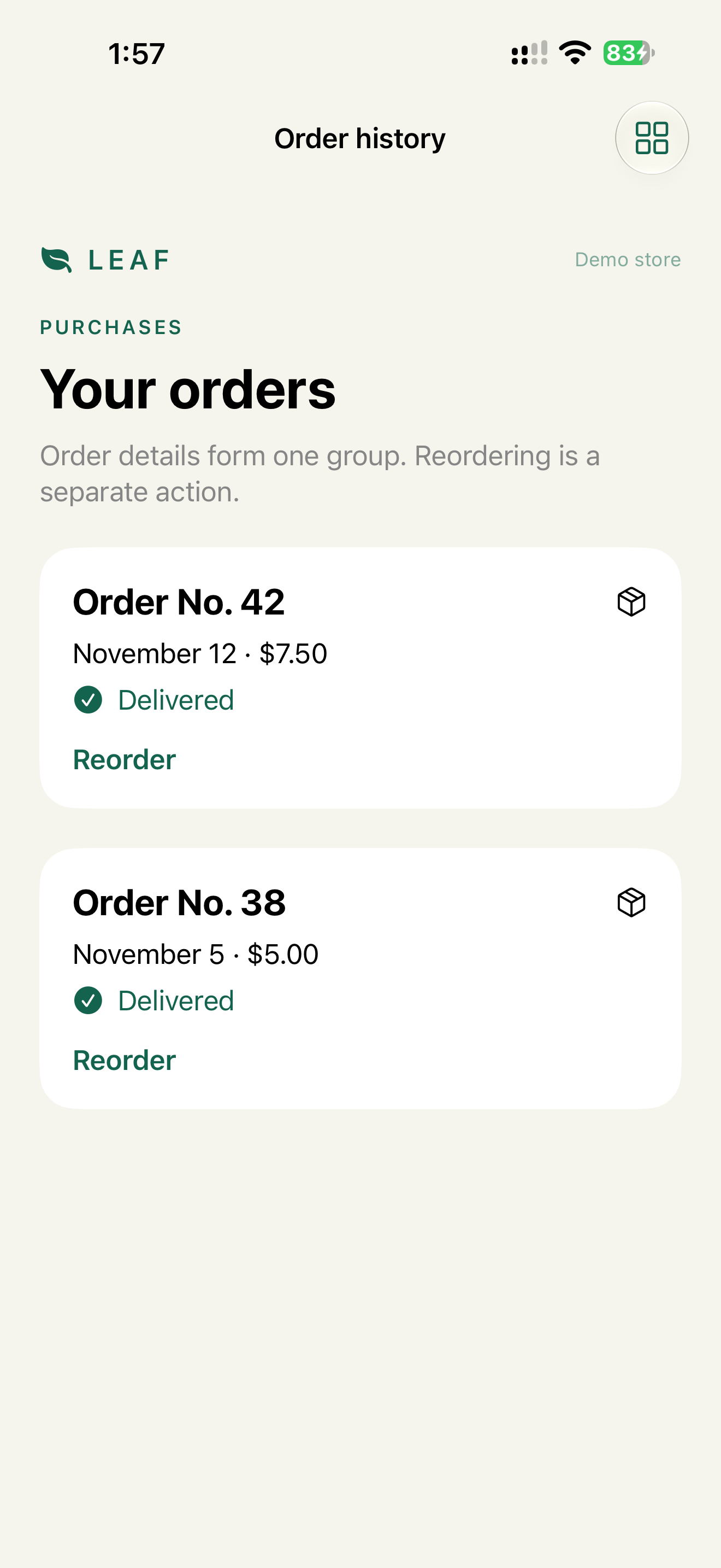
When the card is mostly a summary and the action is secondary, the whole card can be one element with a custom action:
OrderCard(order)
    .accessibilityElement(children: .ignore)
    .accessibilityLabel("Order \(order.number)")
    .accessibilityValue("\(order.status), \(order.total)")
    .accessibilityAction(named: "Reorder") { reorder(order) }
That's one stop per order, but the action is only in the Actions rotor. For a primary action, keep the button.
If the image carries meaning (a product photo the user chooses by), give it a real label, not a file name.
What we don't do
- We don't combine editable fields, toggles, pickers or destructive actions into one element. That's Over Grouped Control.
- We don't put
.combineon a whole screen to cut stops.
Check
Profile:   VoiceOver
Task:      find the last delivered order and reorder it
Expected:  no decorative image is a stop
           one stop per order summary, then its Reorder button
           the Reorder button names the order
Profile:   Switch Control
Task:      scan order history
Expected:  one scan stop per order summary and one per action
           Reorder reachable without a hidden gesture
WCAG mapping
1.3.1 Info and Relationships: the visual group is a semantic group.2.4.3 Focus Order: the order follows the task.4.1.2 Name, Role, Value: controls have a useful name and role.
App Store and product risk
Rarely a rejection on its own. The cost is evidence: with noisy order history or payment rows, the team can't honestly claim the flow works with VoiceOver or Switch Control.