Tiny Target
Status: ready
Symptom
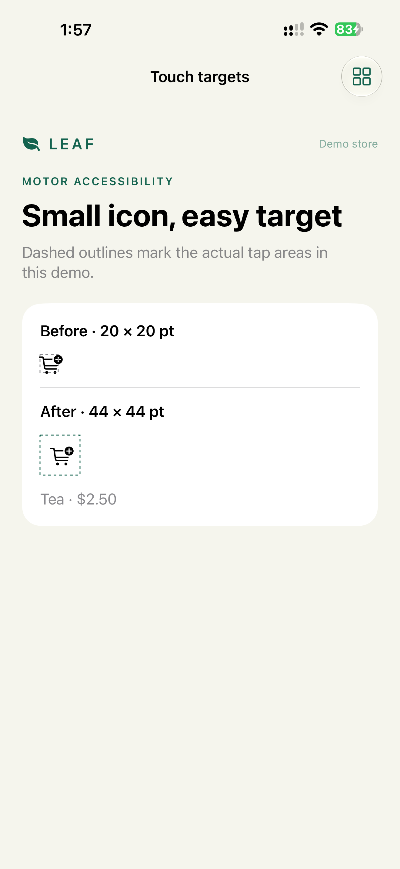
The control's tap area is as small as its icon: 20 × 20 pt instead of 44 × 44 pt. The user misses, hits the neighbor, or can't activate it reliably.
QA: "I can see it, but I keep missing it."
Where it shows up
Close, clear, favorite, info, quantity steppers, map pins, media controls, toolbar icons, calendar days, inline chips.
Why it blocks the task
The control requires precise touch. That fails for users with tremor or fatigue, for one-handed use and for anyone holding the phone on a moving bus. Voice Control's number overlay puts small numbers on top of each other. When a small target sits next to a destructive one, a miss deletes something.
Root cause
The visual size was treated as the tap size.
onTapGestureon a bareImageorText.- Padding that looks like 44 pt but isn't. 17 pt icon + 12 pt on each side = 41 pt.
.contentShapeon the outside of aButton, where it doesn't change the button's hit area.- A destructive action within a few points of a frequent one.
Before
Image(systemName: "xmark")
    .onTapGesture { close() }
No button role, and the hit area is the glyph.
Fix
Verdict: a real Button, with a frame of at least 44 × 44 pt inside its label. Destructive actions are separated from frequent ones.
Why: 44 × 44 pt is Apple's minimum. The frame inside the label is what the button actually hit-tests. The icon can stay small.
Button {
    close()
} label: {
    Image(systemName: "xmark")
        .frame(minWidth: 44, minHeight: 44)
        .contentShape(Rectangle())
}
.accessibilityLabel("Close")
UIKit:
var config = UIButton.Configuration.plain()
config.image = UIImage(systemName: "xmark")
let closeButton = UIButton(configuration: config)
closeButton.accessibilityLabel = "Close"
NSLayoutConstraint.activate([
    closeButton.widthAnchor.constraint(greaterThanOrEqualToConstant: 44),
    closeButton.heightAnchor.constraint(greaterThanOrEqualToConstant: 44)
])
When space allows, visible text is even better: Label("Clear search", systemImage: "xmark.circle").
Destructive actions don't sit next to frequent ones:
Bad:     [Close] [Delete]
Better:  [Close]                 [Delete account]   + confirmation
Check
Profile:   Accessibility Inspector
Task:      inspect every icon button on the screen
Expected:  each frame is at least 44 × 44 pt
           the audit reports no hit region issues
Profile:   touch, one hand
Task:      close the sheet 10 times in a row
Expected:  10 out of 10 hits, Delete never triggered
Profile:   Voice Control, "Show numbers"
Task:      read the numbers on the toolbar
Expected:  numbers don't overlap
WCAG mapping
2.5.8 Target Size (Minimum): at least 24 × 24 CSS px, or enough spacing. Apple's 44 pt is stricter.2.5.5 Target Size (Enhanced): 44 × 44.4.1.2 Name, Role, Value: the target is a real control.