10. SwiftUI accessibility
Status: draft
Chapter goal
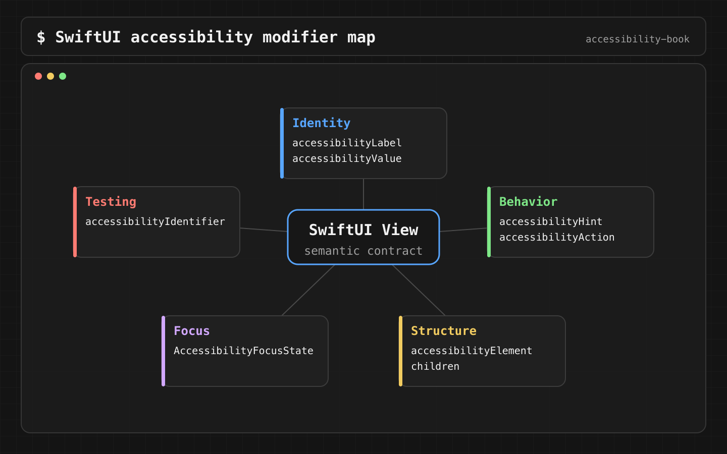
SwiftUI gives good accessibility defaults as long as you use native controls. Custom UI loses them one modifier at a time. This chapter is a PR-ready set of SwiftUI decisions: which control, which modifier, and how to confirm the result.
The screen
The Leaf order history: custom cards, an icon-only cart button, swipe-to-delete, an error sheet. Visual QA passes. With VoiceOver:
- The card is five stops: "Order No. 42", "November 12 · $7.50", "Delivered", an image, "Reorder".
- The cart icon is read as "button". No name.
- Delete exists only as a swipe on a custom row.
- After a failed refresh, focus stays on a list that no longer exists.
Constraints
- Native control first, modifier second. A modifier on a fake control fixes VoiceOver and leaves keyboard, Switch Control and Voice Control broken.
accessibilityLabelonly when the visible text isn't enough. AButton("Pay")already has the label "Pay".accessibilityIdentifieris for tests. It's never read to the user.- No deprecated
accessibility(...)modifiers.accessibility(label:)and similar have been deprecated since iOS 14. UseaccessibilityLabel(_:).
Decision 1: Don't fake controls
Verdict: Button, Toggle, Slider, Stepper, Picker, TextField, NavigationLink. Not Text or Image with onTapGesture.
// Before
Text("Pay").onTapGesture { pay() }

// After
Button("Pay") { pay() }
Why: Button comes with the button trait, Full Keyboard Access focus, a Switch Control stop, a Voice Control name, a disabled state and button styling. onTapGesture comes with nothing.
When the look really can't be built from a native control, accessibilityRepresentation keeps the custom drawing and exposes a native control to assistive technologies:
StarRating(value: $rating)
    .accessibilityRepresentation {
        Slider(value: $rating, in: 1...5, step: 1) {
            Text("Rating")
        }
    }
VoiceOver reads it as an adjustable slider. Swiping up and down changes the rating.
Check: Accessibility Inspector shows the right trait (Button, Adjustable, Toggle) for every interactive element.
Decision 2: Icon buttons get a name
Verdict: Button(_:systemImage:) or Label with .labelStyle(.iconOnly). The title becomes the accessible name.
Button("Cart", systemImage: "cart") { openCart() }
    .labelStyle(.iconOnly)
Why: the title is hidden visually but used by VoiceOver and Voice Control. One string, no separate accessibilityLabel to keep in sync. A bare Image(systemName:) gets a name generated from the symbol, like "cart", but custom images get the asset name or nothing.
Check: VoiceOver reads "Cart, button". Voice Control: "Tap Cart" works.
Decision 3: Group by meaning
Verdict: the description is one element. The actions stay separate.
| Modifier | Use when |
|---|---|
.accessibilityElement(children: .combine) |
The visible text is already good. SwiftUI joins it |
.accessibilityElement(children: .ignore) + label/value |
You need different wording than what's shown |
.accessibilityElement(children: .contain) |
Keep children separate, but treat them as a group (for order, Switch Control group scanning) |
.accessibilityHidden(true) |
Decorative: illustrations, dividers, duplicate icons |
VStack(alignment: .leading) {
    Text("Order No. 42")
    Text("November 12 · $7.50")
    Label("Delivered", systemImage: "checkmark.circle.fill")
}
.accessibilityElement(children: .combine)

Button("Reorder") { reorder(42) }
    .accessibilityLabel("Reorder 42")
Why not one element for the whole card, including the button: with .combine, a single button inside becomes the combined element's default action. VoiceOver users can still activate it, but it disappears as a separate, named control. With two buttons inside, all but one become hard to find. Keep visible buttons as separate elements.
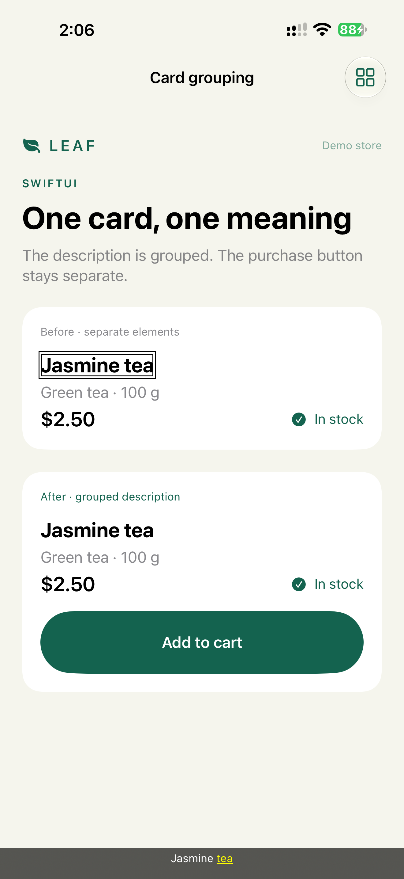
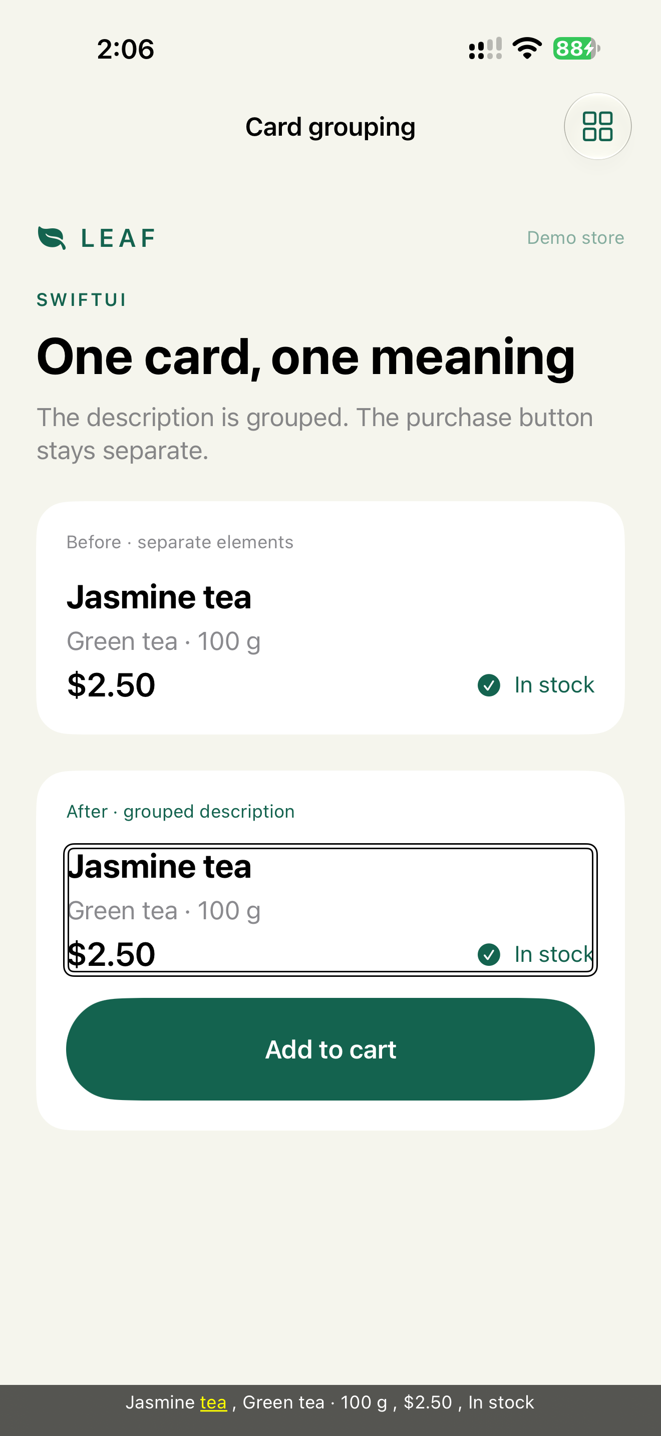
Check: count VoiceOver stops per card. Description plus one per visible action.
Decision 4: State goes in traits and values
Verdict: selected → .isSelected trait. On/off, percent, count → accessibilityValue. Headings → .isHeader.
FilterChip("Open now", isOn: filter.openNow)
    .accessibilityAddTraits(filter.openNow ? .isSelected : [])

Text("Your orders")
    .font(.title.bold())
    .accessibilityAddTraits(.isHeader)
Native Toggle, Slider, Stepper and Picker already expose their value. Don't add another one on top.
Details: Chapter 4 (State 1), Chapter 5 (Decisions 2 and 3).
Decision 5: Every gesture has an action
Verdict: swipeActions in a List is already accessible. A custom gesture gets accessibilityAction(named:).
OrderRow(order)
    .gesture(swipeToDelete)
    .accessibilityAction(named: "Delete") { delete(order) }
For values that change by drag, accessibilityAdjustableAction maps VoiceOver swipe up/down:
VolumeKnob(value: $volume)
    .accessibilityLabel("Volume")
    .accessibilityValue("\(Int(volume * 100)) percent")
    .accessibilityAdjustableAction { direction in
        switch direction {
        case .increment: volume = min(volume + 0.1, 1)
        case .decrement: volume = max(volume - 0.1, 0)
        @unknown default: break
        }
    }
Details: Adjustable controls.
Decision 6: Focus moves to recovery
Verdict: after an error or a modal, @AccessibilityFocusState puts VoiceOver focus where the user continues.
@AccessibilityFocusState private var errorFocused: Bool

if let error {
    Text(error)
        .accessibilityFocused($errorFocused)
}

Button("Continue") {
    error = validate()
    errorFocused = error != nil
}
@AccessibilityFocusState moves assistive technology focus. @FocusState moves keyboard focus. They're separate. Set both if keyboard users also need to move. Full pattern with modals: Chapter 4, States 3 and 4.
Decision 7: Identifier is for tests
Verdict: accessibilityIdentifier on every element a UI test touches. Never used as a label.
Button("Add to cart") { add(product) }
    .accessibilityIdentifier("product.add")
Why: identifiers are stable across localizations and copy changes. Labels change with every translation. Tests use identifiers, people hear labels.
Previews as the first check
Verdict: every reusable component has previews at a default size, an accessibility size, dark mode and Bold Text.
#Preview("AX3") {
    DeliveryCard().dynamicTypeSize(.accessibility3)
}
#Preview("Dark") {
    DeliveryCard().preferredColorScheme(.dark)
}
#Preview("Bold") {
    DeliveryCard().environment(\.legibilityWeight, .bold)
}
Xcode canvas also has Variants → Dynamic Type Variants to show all 12 sizes at once.
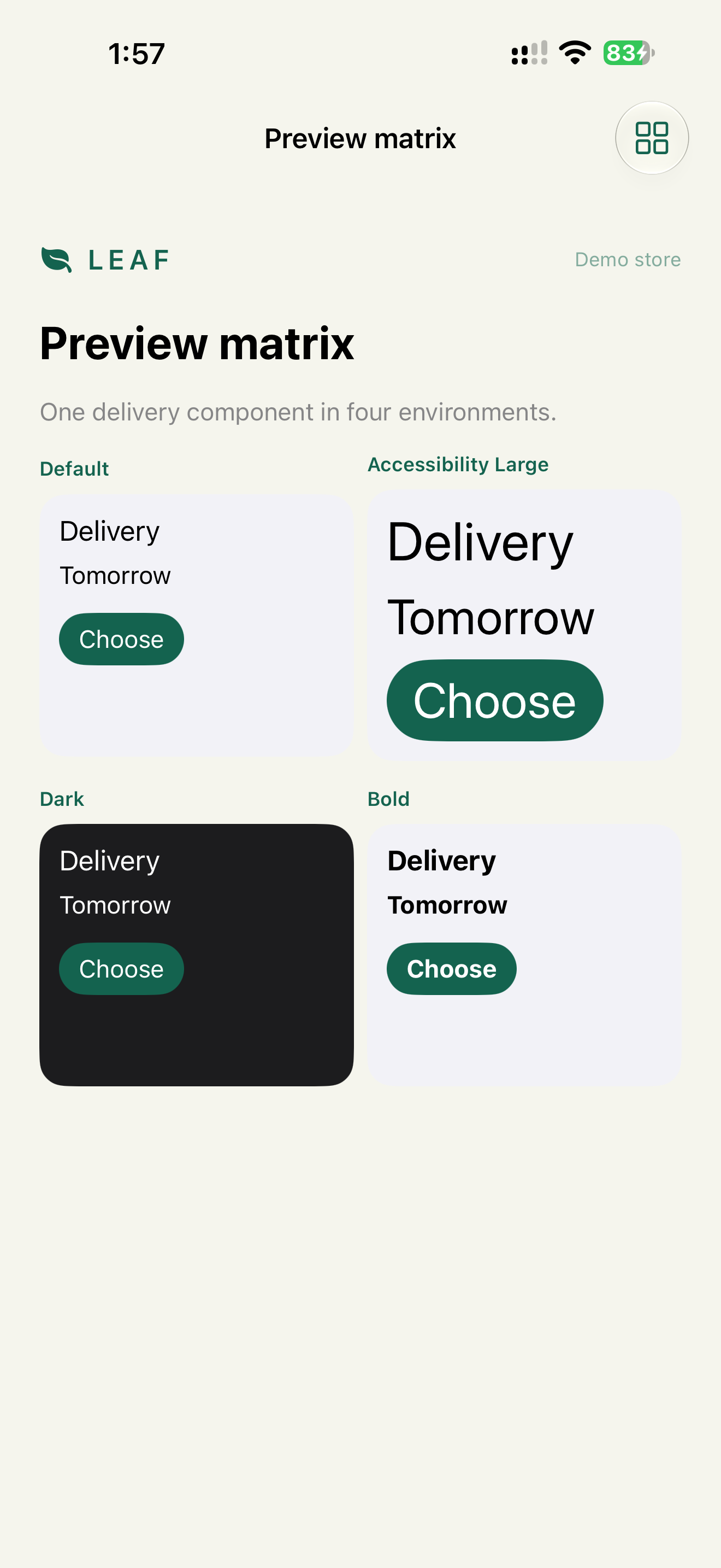
Previews check layout. They don't check VoiceOver, which needs Accessibility Inspector or a device.
UIKit inside SwiftUI
UIViewRepresentable doesn't inherit SwiftUI semantics. The UIKit view inside needs its own isAccessibilityElement, labels and accessibilityElements order. See the demo's UIKitCell and Chapter 11.
Review prompt
In this SwiftUI code, find: onTapGesture on Text or Image, icon buttons
without a title, fixed frame heights around Text, selected state without
.isSelected, custom gestures without accessibilityAction, deprecated
accessibility(...) modifiers, hardcoded left/right instead of leading/trailing.
Grep finds the same patterns faster, and an AI review explains them. Accessibility Inspector confirms the result.
What we don't do
- We don't put
accessibilityLabelon aButton("Pay"). It already has a label. - We don't add
accessibilityValueto nativeToggleorSlider. - We don't wrap whole screens in
.combine.
Related catalog entries
- Mystery Icon: icon button without a name.
- Over Grouped Control: grouping hides controls.
- Clipped Large Text: fixed frames and Dynamic Type.
- Semantic Control: native controls first.
- Right Sized Grouping: between noise and hidden controls.
- Dynamic Type Contract: layout at accessibility sizes.
- Adjustable controls: sliders, steppers, pickers.
Chapter takeaway
Native control, then the minimum modifier. Group the description, keep actions separate, state in traits and values, focus to recovery, identifiers only for tests.
Sources
- Apple Developer: SwiftUI accessibility modifiers
- Apple Developer: accessibilityElement(children:)
- Apple Developer: accessibilityRepresentation
- Apple Developer: accessibilityAdjustableAction
- Apple Developer: accessibilityAction
- Apple Developer: AccessibilityFocusState
- Apple Developer: accessibilityIdentifier