Rotor and custom actions
Status: draft
When to use this guide
The screen is long, every card has secondary actions, and a VoiceOver user needs 20 swipes for one action. The rotor and custom actions make that faster, and they're easy to overload. This guide shows what goes where.
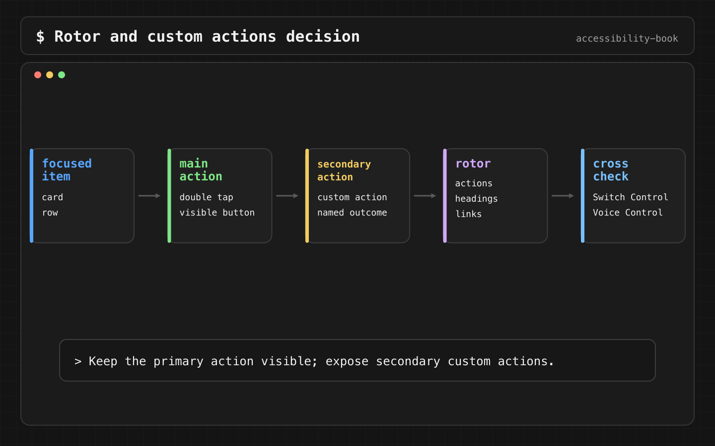
custom action.How they work
The rotor (two-finger twist) changes what a vertical swipe does: move by headings, links, form controls, actions, words and other units, depending on the screen and the user's settings.
Custom actions appear in the rotor's Actions item for the focused element. The user swipes up or down to pick one and double-taps.
The rule
Verdict: the element's main action is the double tap. Secondary actions on the same object are custom actions, with names that say the outcome. Frequent actions stay visible buttons.
Why: the user gets one stop per object and still reaches every action. A frequent action hidden in the rotor is too slow to find and invisible to Voice Control.
| Action | Where |
|---|---|
| Open the order (main) | Double tap on the card |
| Reorder, Cancel order (secondary) | Custom actions |
| Add to cart on a product screen (frequent, primary) | Visible button |
Implementation
SwiftUI:
OrderCard(order)
    .accessibilityElement(children: .combine)
    .accessibilityAddTraits(.isButton)
    .onTapGesture { open(order) }
    .accessibilityAction(named: "Reorder") { reorder(order) }
    .accessibilityAction(named: "Cancel order") { confirmCancel(order) }
UIKit:
cell.accessibilityCustomActions = [
    UIAccessibilityCustomAction(name: "Reorder") { [weak self] _ in
        self?.reorder(order)
        return true
    },
    UIAccessibilityCustomAction(name: "Cancel order") { [weak self] _ in
        self?.confirmCancel(order)
        return true
    }
]
Names say what happens: "Reorder", "Cancel order". Not "Open", "More" or "Action".
The common mistake
The main action is hidden in a custom action to make the UI look cleaner:
// Bad: double tap does nothing, "Open" is in the Actions rotor
ArticleCard(article)
    .accessibilityAction(named: "Open") { open(article) }

// Good: the card is a button
Button { open(article) } label: { ArticleCard(article) }
A custom action doesn't replace a real control for the main action.
When an element is .adjustable, swipe up and down change its value, so its custom actions are harder to reach. Use separate buttons or a segmented control instead. Adjustable controls.
Check
Profile:   VoiceOver
Task:      reorder order 1042
Expected:  one stop per card
           double tap opens the order
           rotor → Actions lists "Reorder" and "Cancel order"
           each name says the outcome
Profile:   Accessibility Inspector
Expected:  label: Order 1042, Delivered, $24.80
           traits: button
           actions: Reorder, Cancel order
Profile:   Switch Control
Expected:  the same actions are in the scanner menu for the card
Profile:   Voice Control
Expected:  frequent actions can be said by name, so they're visible buttons
Record the results in the format from Accessibility testing toolkit.
What we don't do
- We don't put the main action into a custom action.
- We don't use vague names: "More", "Action", "Open".
- We don't hide frequent actions in the rotor. Voice Control can't see them.
Related materials
Chapter 5, Chapter 7, Chapter 10, Chapter 11, Swipe Trap, Over Grouped Control, Gesture Alternative, Accessible Card, Right Sized Grouping, Accessibility testing toolkit.
Sources
Apple Support: Use VoiceOver gestures on iPhone, Apple Developer: Accessibility Inspector, Apple Developer: accessibilityAction, Apple Developer: UIAccessibilityCustomAction.