9. Cognitive accessibility
Status: draft
Chapter goal
Cognitive accessibility means taking unnecessary work off the user: remembering, guessing, deciding under pressure, starting over. It's not "dumbing down". Clear errors, saved progress and one obvious next step help everyone, and for some users they decide whether the task can be done at all. This chapter covers five sources of load and the iOS modes, Assistive Access and Guided Access, that simplify the device for the people who need it most.
The screen
Leaf checkout, the version that technically works:
- The address is rejected with "Invalid input". Which field? What's wrong with it?
- After the error, the email field is empty. The user types it again.
- Between address and payment, a "Rate us!" prompt appears.
- The same thing is called "Bag" on one screen, "Cart" on the next, "Basket" in the email.
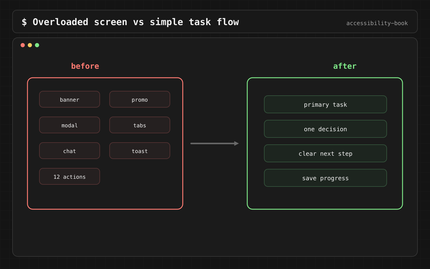
- Five buttons of equal weight: Continue, Save for later, Add gift note, Apply promo, Back.
None of these is a crash, and every one of them adds work. For a user with a learning disability, ADHD, a brain injury, dementia, or plain stress and fatigue, each one is a point where they may give up.
Constraints
- We don't remove features to simplify. We order them: one primary action, the rest secondary.
- We don't hide information to shorten a screen. If it's needed for the decision, it stays.
- Critical flows have no interruptions. Payment, health, account recovery, support: no upsells, no rating prompts, no surprise modals.
Decision 1: The error says what to do
Verdict: an error message names the field, the problem and the fix.
// Before
error = "Invalid input"

// After
error = "Enter a house number. For example: 12 Oak Street."
This is the demo's error text. The empty-search message follows the same rule: "No results found. Try another search or clear your filters", with a Clear filters button next to it.
Why: "Invalid input" sends the user to guess, then re-read the form, then guess again. An instruction is one step. VoiceOver reads the same text, so this also covers Chapter 4, State 3.
Check: read the error alone, without the screen. It's still clear what to do.
Decision 2: An error never erases input
Verdict: after a failed submit, everything the user entered stays in place. Only the failed field is marked.
@State private var email = ""
@State private var address = ""
@State private var addressError: String?

Button("Continue") {
    addressError = address.contains(where: \.isNumber)
        ? nil
        : "Enter a house number. For example: 12 Oak Street."
    // email and address are not reset
}
For longer flows, the draft also survives leaving the app:
@SceneStorage("checkout.address") private var address = ""
Why: retyping is extra load for everyone, and for someone using Switch Control or Voice Control it's minutes. The demo's error screen says it outright: "Your order and entered details are kept when an error occurs."
Check: fill the form, trigger an error, switch to another app and back. Nothing is lost.
Decision 3: One primary action per step
Verdict: one visually prominent button per screen. Secondary actions are smaller, or move into a menu.
Button("Continue") { next() }
    .buttonStyle(.borderedProminent)

Menu("More options") {
    Button("Save for later") { save() }
    Button("Add gift note") { addNote() }
}
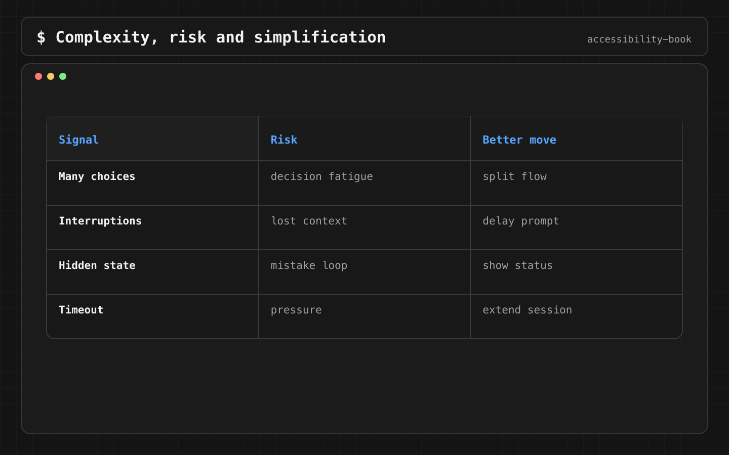
Why: five buttons of equal weight are five decisions. The user has to read all of them to find the one that moves forward. One prominent button says what's next.
Check: squint test. With the screen blurred, it's obvious which button continues.
Decision 4: Same thing, same name
Verdict: one term per concept across the app, emails, notifications and support docs. It's written down in the glossary.
Why: "Bag", "Cart" and "Basket" make the user wonder whether they're three different things. Voice Control users also have to remember which word appears on which screen. VoiceOver users hear all three.
The book keeps its own terminology glossary for the same reason.
Check: search the localization file for synonyms of key terms. Each concept appears under one name.
Decision 5: No interruptions in critical flows
Verdict: during payment, health, account recovery and support, only prompts that belong to the task.
Allowed:     "Session expires in 30 seconds. Extend?"
Not allowed: "Enjoying Leaf? Rate us!", "Upgrade to Premium", "Turn on notifications"
Why: an interruption pushes the task out of working memory. After closing it, the user has to rebuild where they were. For a VoiceOver user, a modal also moves focus, and returning to the right place depends on whether the app handles it (Chapter 4, State 4). SKStoreReviewController / requestReview should be called after a completed task, not during one.
Check: walk every critical flow from start to finish. Count the modals that aren't part of the task. The target is zero.
Assistive Access and Guided Access
iOS has two modes that simplify the whole device.
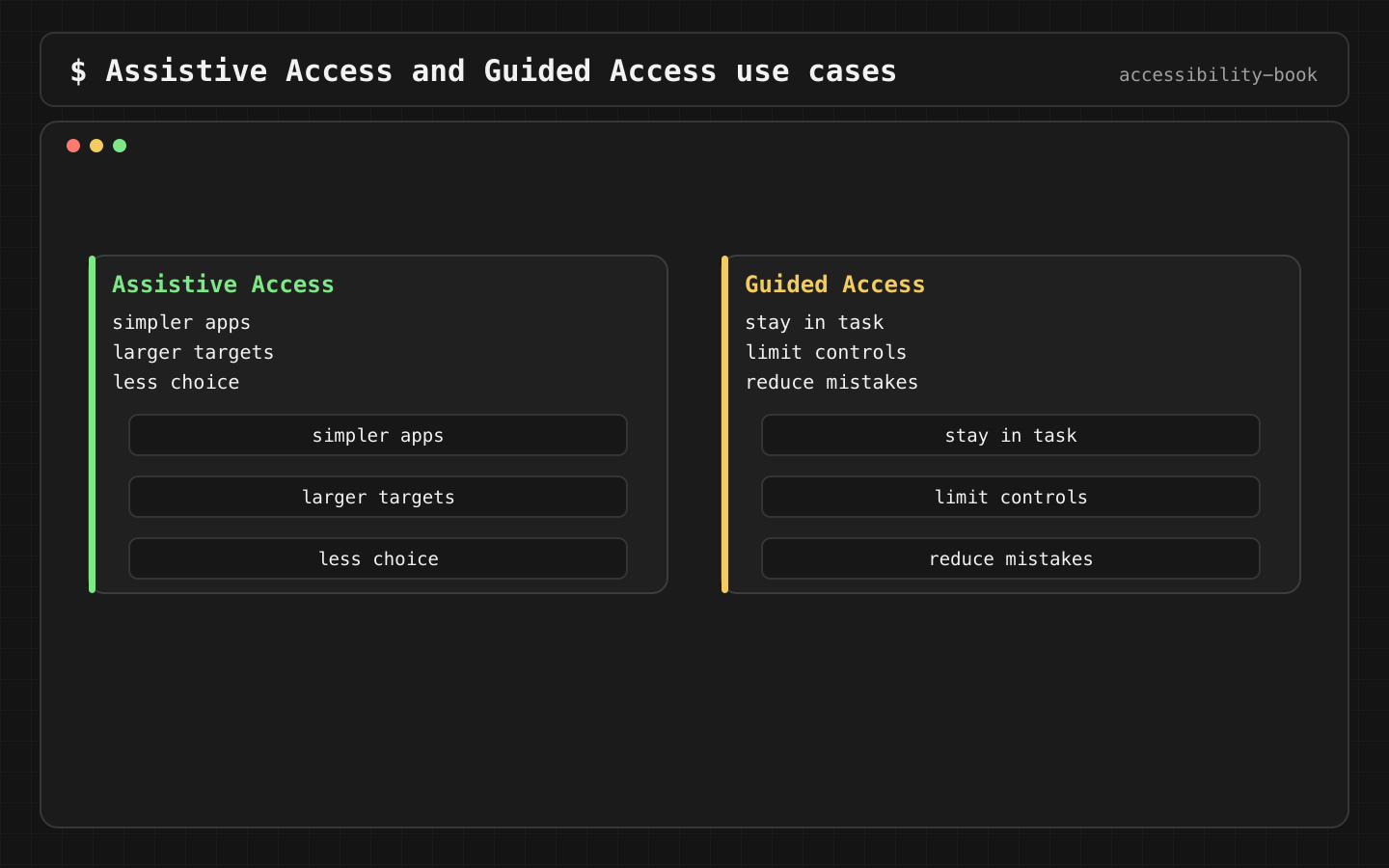
Assistive Access replaces the iOS interface with large buttons, a reduced set of apps and simplified versions of Phone, Messages, Camera and Photos. It's set up by a trusted supporter for people with significant cognitive disabilities. Third-party apps run inside it. Since iOS 17 they can opt into full-screen layout with the UISupportsFullScreenInAssistiveAccess Info.plist key. Since iOS 26 an app can provide its own Assistive Access interface: the UISupportsAssistiveAccess key plus an AssistiveAccess scene in SwiftUI. What goes into that interface is a product decision: the one or two tasks the user actually needs.
Guided Access locks the device to one app and can disable parts of the screen, hardware buttons and touch. It's used by parents, teachers, therapists and kiosks. An app can check whether it's on with UIAccessibility.isGuidedAccessEnabled, and can expose its own restrictions, for example "Disable purchases", through UIGuidedAccessRestrictionDelegate.
Check: turn on Assistive Access with the app added. The main task can be completed in the simplified layout.
Review prompt
AI is good at rewriting copy. The meaning still needs a human check:
Rewrite this error so it names the field, the problem and the next step.
Max 15 words. Keep medical and legal meaning unchanged.
List every term used for the same concept across these screens and strings.
What we don't do
- We don't write "Something went wrong" for an error the app can identify.
- We don't use dark patterns: hidden cancel, pre-checked consent, confirmshaming. They load everyone and trap the users who can least afford it.
- We don't hide support. It's one tap from every critical flow.
Platform notes
- SwiftUI / UIKit: focus after errors (Chapter 4) and state preserved across errors matter more than copy polish.
@SceneStorage/ state restoration for drafts. - AppKit: menu items and commands use the same terms as iOS.
Related catalog entries
- Disabled Mystery: the user is blocked and can't tell why.
- Timeout Pressure: the task gets harder as time runs out.
- Announcement Spam: too many interruptions by voice.
- Silent Error: the error exists, recovery doesn't start.
- Disabled State Explanation: explain why progress is blocked.
- Time Extension: extendable time limits.
- Meaningful Announcement: speak only what matters.
Chapter takeaway
Errors say what to do, input survives errors, one primary action per step, one name per concept, no interruptions in critical flows.
Sources
- Apple Human Interface Guidelines: Accessibility
- Apple Support: Cognitive accessibility features on iPhone
- Apple Support: Use Assistive Access on iPhone
- Apple Support: Use Guided Access on iPhone
- Apple Developer: UIGuidedAccessRestrictionDelegate
- Apple Developer: SceneStorage
- W3C: Making Content Usable for People with Cognitive and Learning Disabilities