1. Why accessibility matters
Status: draft
Chapter goal
Accessibility means a person can complete a task on their own: pay, reschedule, contact support, turn off a setting. It's a product requirement with a pass/fail result, not a set of labels added before release. This chapter sets the model the rest of the book uses: the task, the ways a person interacts, and the team's responsibility for each one.
The book works in three layers. Chapters explain. Accessibility Smells describe problems. Accessibility Patterns describe fixes. Guides such as VoiceOver gestures show how to check them by hand.
Who this is about
According to WHO, about 1.3 billion people, 1 in 6, live with a significant disability. CDC puts it at about 1 in 4 adults in the US.
That's not counting temporary and situational cases: a broken wrist, bright sun on the screen, a loud train, a phone in one hand and a child in the other. Many iPhone users turn on Larger Text without thinking of it as accessibility.
The screen
Checkout in a delivery app. A sighted user with default settings finishes it in 30 seconds. Then:
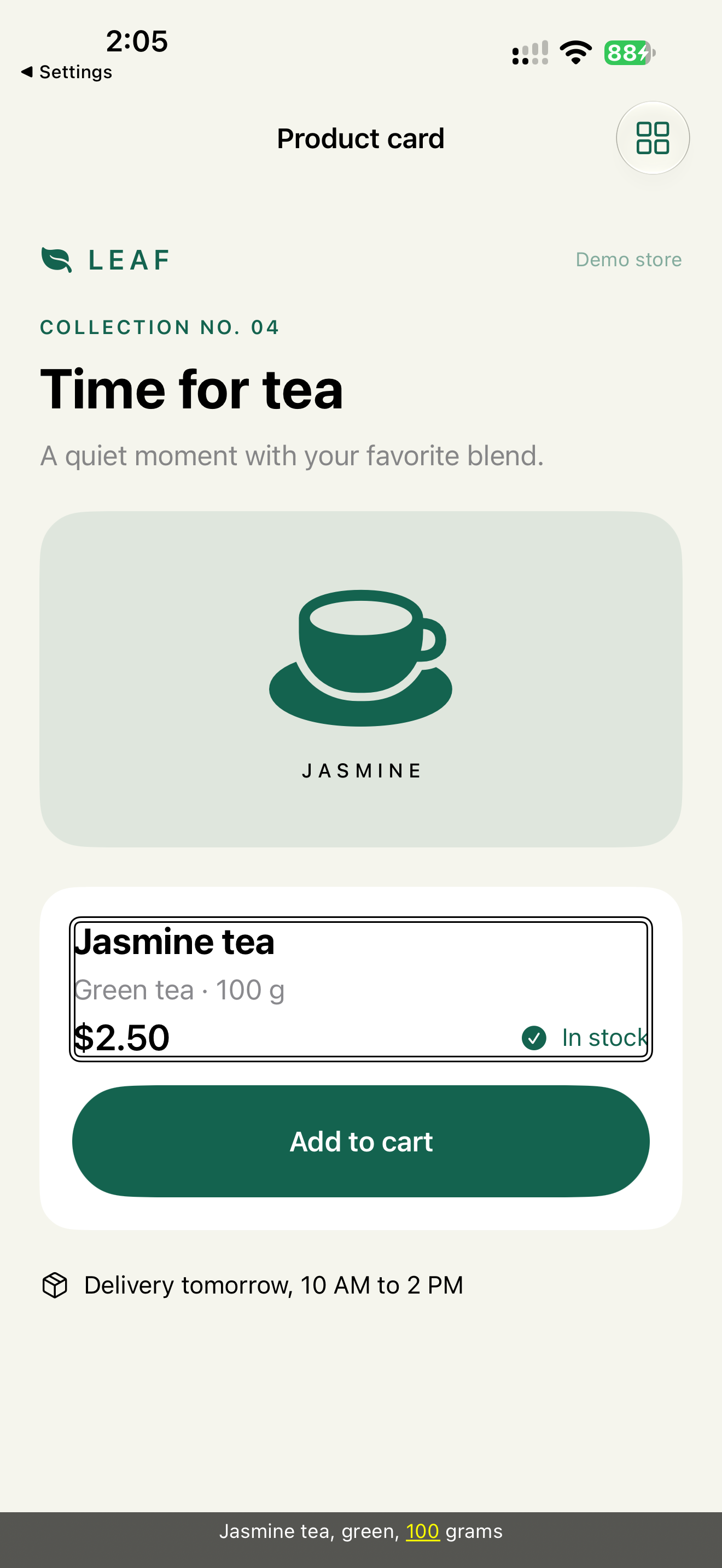
- VoiceOver. The product card is read as "image, Jasmine tea, Green tea · 100 g, $2.50, In stock, button". Six stops, and the button has no name.
- Dynamic Type at an accessibility size. The Pay button moves below the visible area, and the sticky footer covers it.
- Motor. The close icon on the address sheet is 20 × 20 pt. Apple's minimum is 44 × 44.
- Color. The email error is shown only as a red border.
- Gesture. Removing an item works only by swipe.
For the team, these are five small tickets. For the user, the result is one: the order can't be placed. They ask someone for help, go to a competitor, or leave a one-star review without details. Analytics show a drop-off on checkout, but not the reason.
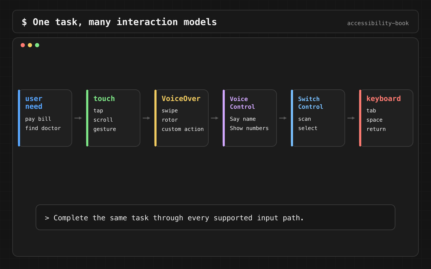
Three views of the same thing
| For | Accessibility means | Failure looks like |
|---|---|---|
| The user | Doing it alone | Asking someone else, or giving up |
| The product | Trust, retention, fewer silent drop-offs | Conversion loss with no visible cause |
| Engineering | Semantics, layout, focus, feedback, testable behavior | Random VoiceOver output, clipped text, unreachable actions |
For the business there are also market access, support costs, App Store Accessibility Nutrition Labels, and legal and procurement requirements like the European Accessibility Act. Business case for accessibility covers this for leadership.
What iOS gives, and what is left to the app
Apple groups accessibility features by need: Vision, Mobility, Hearing, Speech, Cognitive (iPhone User Guide, iOS 26). iOS 26 added more: Braille Access, Vehicle Motion Cues on more devices, and sharing your accessibility settings temporarily with another iPhone or iPad (What's new in iOS 26).
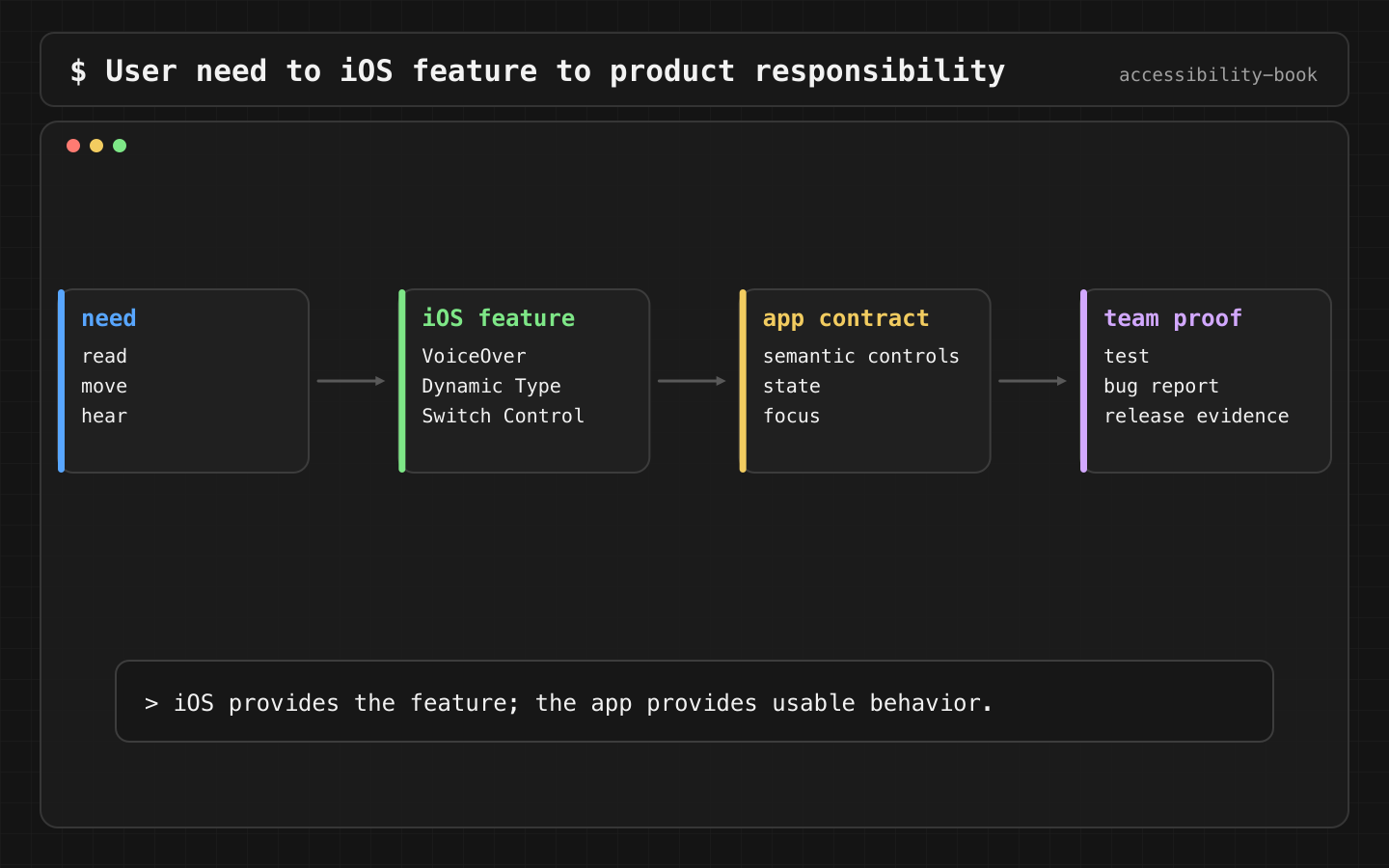
The system provides the tools. The app decides whether they work. VoiceOver can't read a name that was never set. Dynamic Type can't grow text in a frame with a fixed height. Switch Control can't reach an action that exists only as a gesture. Chapter 2 maps each setting to what the app owes it.
Why a label is not enough
The most common misconception: "accessibility = add accessibilityLabel". A label fixes one thing, the name. It doesn't fix:
- Focus order that jumps around the screen.
- A modal that opens with focus left behind it.
- An error that appears without focus moving to it.
- An action that only exists as a swipe or drag.
- Large text pushing the main button off screen.
- Success shown only as green color.
- A setup video without captions.
Each of these needs its own fix: order, focus, layout, alternative actions, copy, media. Labels are one layer of about ten: semantics, layout, copy, interaction, feedback, timing, media, localization, testing, ownership.
What engineering owns
Visual UI is pixels. Accessibility is semantic output: what an assistive technology gets from the app. If the output is random, the UX is random for the person using it.
Button {
    pay()
} label: {
    Image(systemName: "creditcard")
}
.accessibilityLabel("Pay for order")
.accessibilityIdentifier("checkout_pay_button")
The label is what the user hears. The identifier is for UI tests and is never spoken. These are two different jobs, and mixing them up is a common bug: an identifier like checkout_pay_button used where a label belongs.
UIKit has the same two properties:
payButton.accessibilityLabel = "Pay for order"
payButton.accessibilityIdentifier = "checkout_pay_button"
Native controls come with semantics. A custom view comes with nothing. A chart, a card, a custom slider, a map pin, a calendar cell: for each one, the team has to say what it is, what state it's in and what it can do.
Where it fits in the workflow
| Stage | What gets checked |
|---|---|
| Discovery | Who can be blocked by this flow, which task is critical, what a failure costs |
| Design | Not only the default screen: loading, empty, error, success, disabled, selected, long text, large text, dark mode |
| Development | Native controls first. Custom UI gets explicit semantics |
| PR review | Label, value, state, focus, Dynamic Type, gesture alternatives, error recovery |
| QA | Short walkthroughs of critical flows: VoiceOver, Dynamic Type, Reduce Motion, Switch Control or keyboard, captions |
| Release | Severity by user impact, not by component |
| After release | Support tickets, reviews, drop-off data go back to the backlog |
Severity example: a missing label on the Pay button blocks the task, so it blocks the release. A decorative image that VoiceOver stops on is noise, so it goes in the next sprint.
Where AI helps, and where it stops
AI is useful for finding risks: reading screenshots, user stories, code, VoiceOver transcripts. It generates test cases, flags suspicious SwiftUI patterns, rewrites vague error messages.
What it can't do: prove how VoiceOver behaves without a transcript or an accessibility tree, or set severity without knowing the task. When an AI answer is treated as the check, that's AI Verification Theater. The working approach is AI Assisted Triage: AI suggests, tools measure, people decide.
Review this iOS checkout flow for VoiceOver, Dynamic Type,
Voice Control, Switch Control and error recovery.
Return likely blockers and the manual check that confirms each one.
Chapter 14 covers this in detail.
What we don't do
- We don't treat accessibility as a separate phase before release. It's a quality criterion for every task.
- We don't treat one scanner pass as proof (Scanner Theater).
- We don't build custom controls when a native one does the job. Every custom control is semantics the team now has to maintain.
First check
Ten minutes, no tools:
- Turn on VoiceOver. Complete the app's main flow without looking at the screen.
- Set Larger Text to the largest accessibility size. Complete it again.
If the flow breaks in either case, you've found a path through the product nobody has tested. The rest of the book shows how to fix it and keep it fixed.
Related catalog entries
- Accessibility catalog: how to read the book through smells, patterns and case studies.
- Scanner Theater: why one tool pass doesn't prove quality.
- Evidence Based Release: team responsibilities as release evidence.
- Business case for accessibility: the argument for leadership.
Chapter takeaway
Accessibility is checked by one question: can the person finish the task alone, using the way they interact with the phone? A label is one answer among ten.
Sources
- Apple Support: Get started with accessibility features on iPhone
- Apple Support: What's new in iOS 26
- Apple Human Interface Guidelines: Accessibility
- WHO: International Day of Persons with Disabilities 2023
- CDC: Disability Impacts All of Us
- iOS Access for All
- Just Eat Takeaway Tech: Empowering Everyone
- Leanpub: iOS Accessibility Handbook